PROJECT
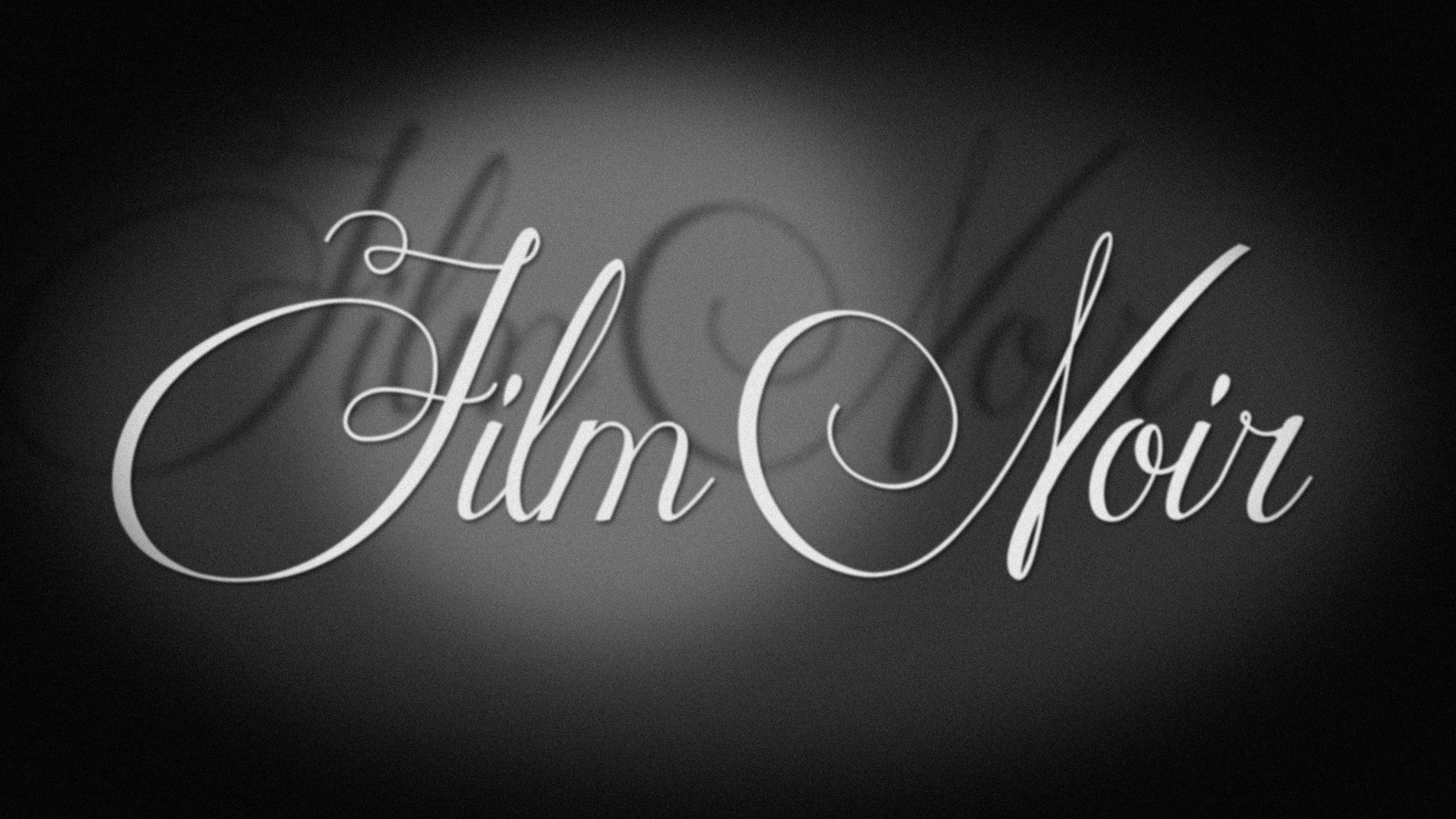
ten main title sequences
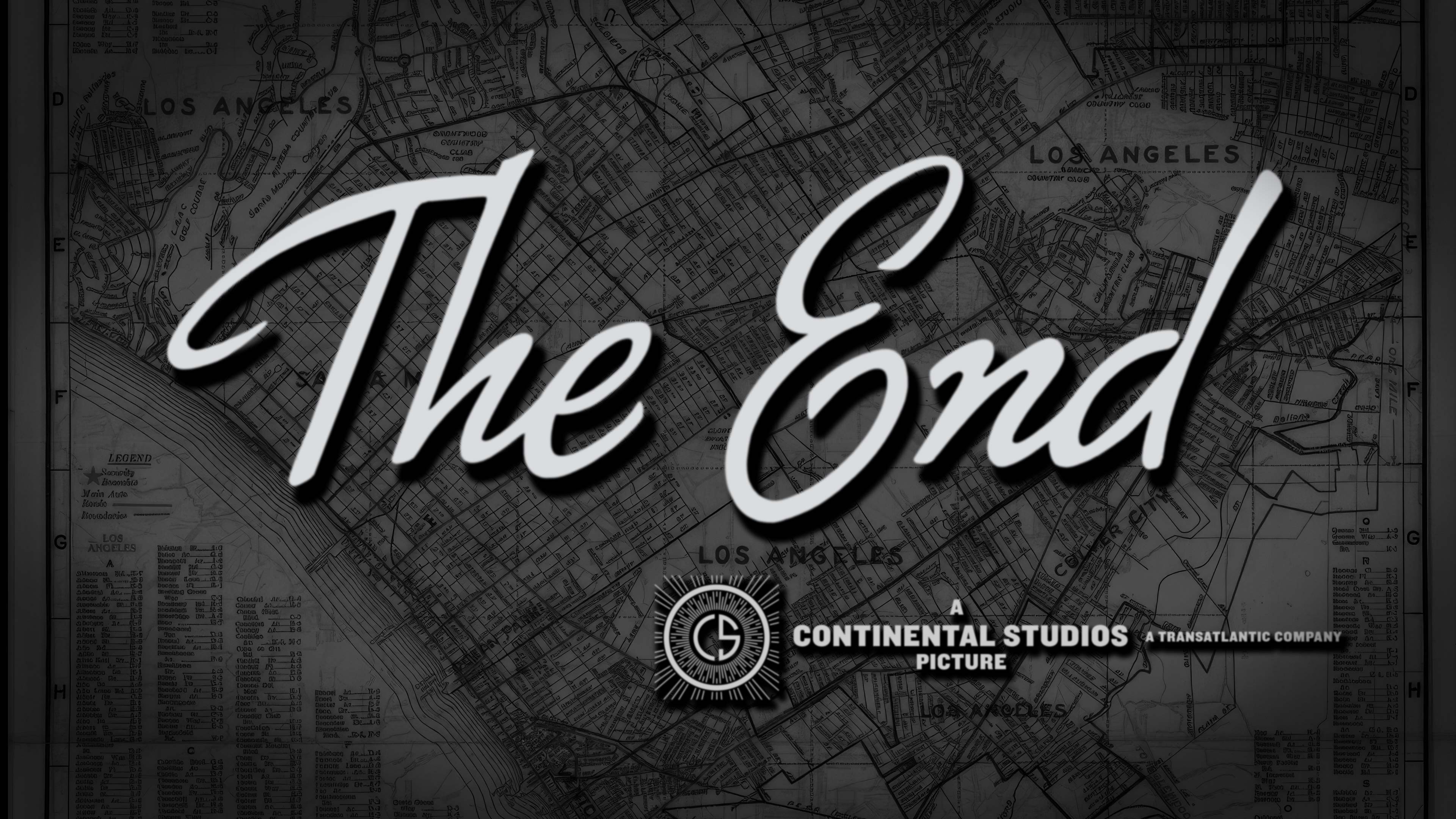
“The End” card
vintage Point Grey animated logo
and other interstitial graphics
STREAMER
AppleTV+
STUDIO
Lionsgate Television
PRODUCTION COMPANY
Point Grey
Shine designed and animated the main title logo, a simple typographic main title sequence, additional typography and graphics, as well as a vintage Point Grey logo.
Critics are praising The Studio on Apple TV+ as a sharp, fast-paced satire of Hollywood. Seth Rogen’s performance as a frazzled movie executive stands out, with many calling the series both absurdly funny and smartly written. Episode 2 has been singled out as one of the best TV episodes of 2025 so far. 95% on Rotten Tomatoes!
The typography was treated to look as if it was shot on an Oxberry animation stand in the 1940s.

Rather than inventing something new, typography and graphics from the golden era of Hollywood were used as reference for design.


A few of the main title logo treatments hand drawn in Procreate on iPad.
Vintage typography inspired by lettering artists in the 1940s was used as inspiration.
Episode title explorations, set in Illustrator then hand drawn in Procreate on iPad.


The Point Grey logo was re-imagined to look as if it were created on a a standard Oxbury animation stand by film title lettering artists in the 1940s.


A few of the main title logo treatments for season one, created in Cinema4D.
Several explorations for a vintage Point Grey logo.

Seth Rogen as a frazzled movie mogul.
Alphabet City main title design in episode 103.


The End explorations.