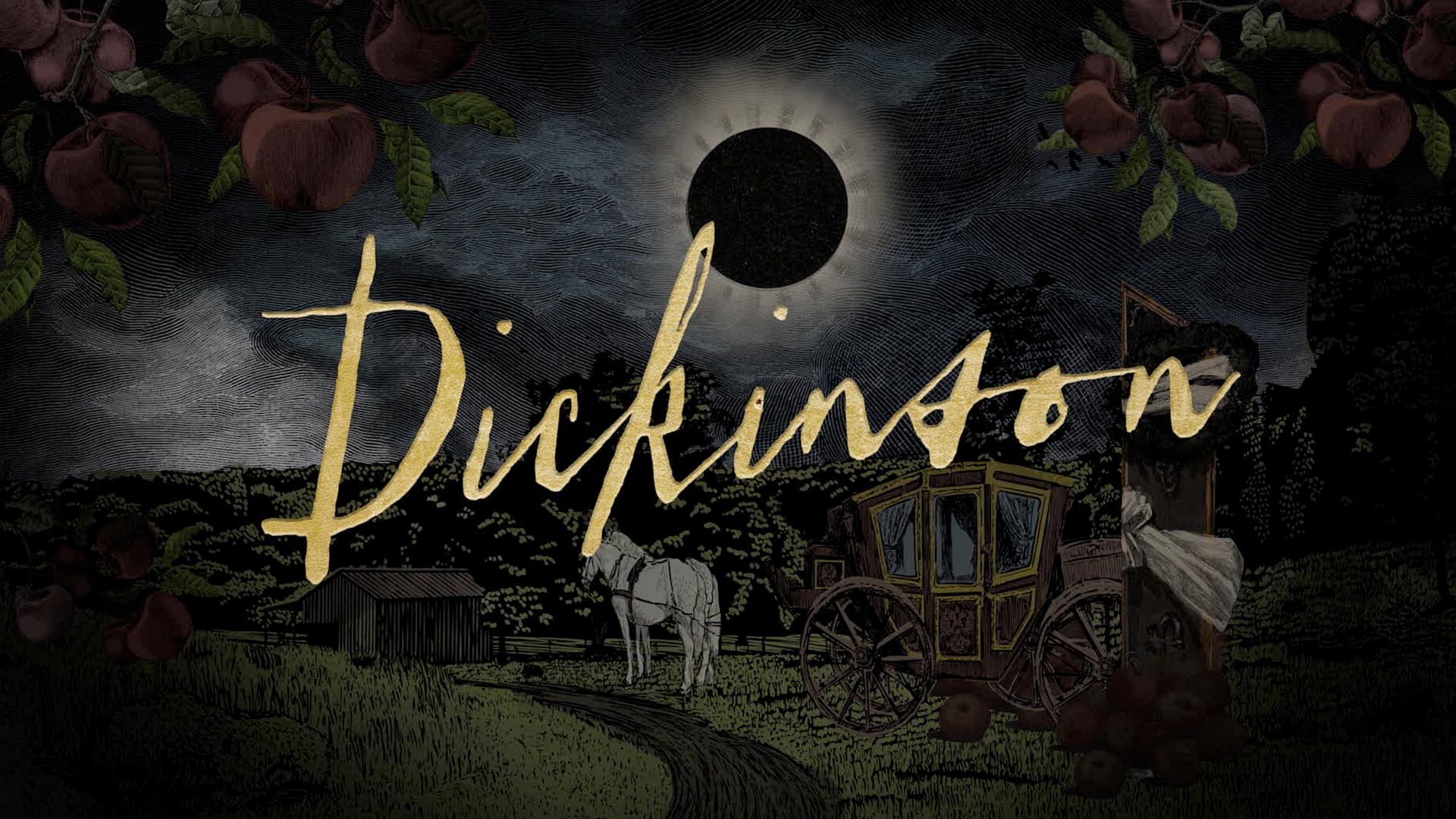
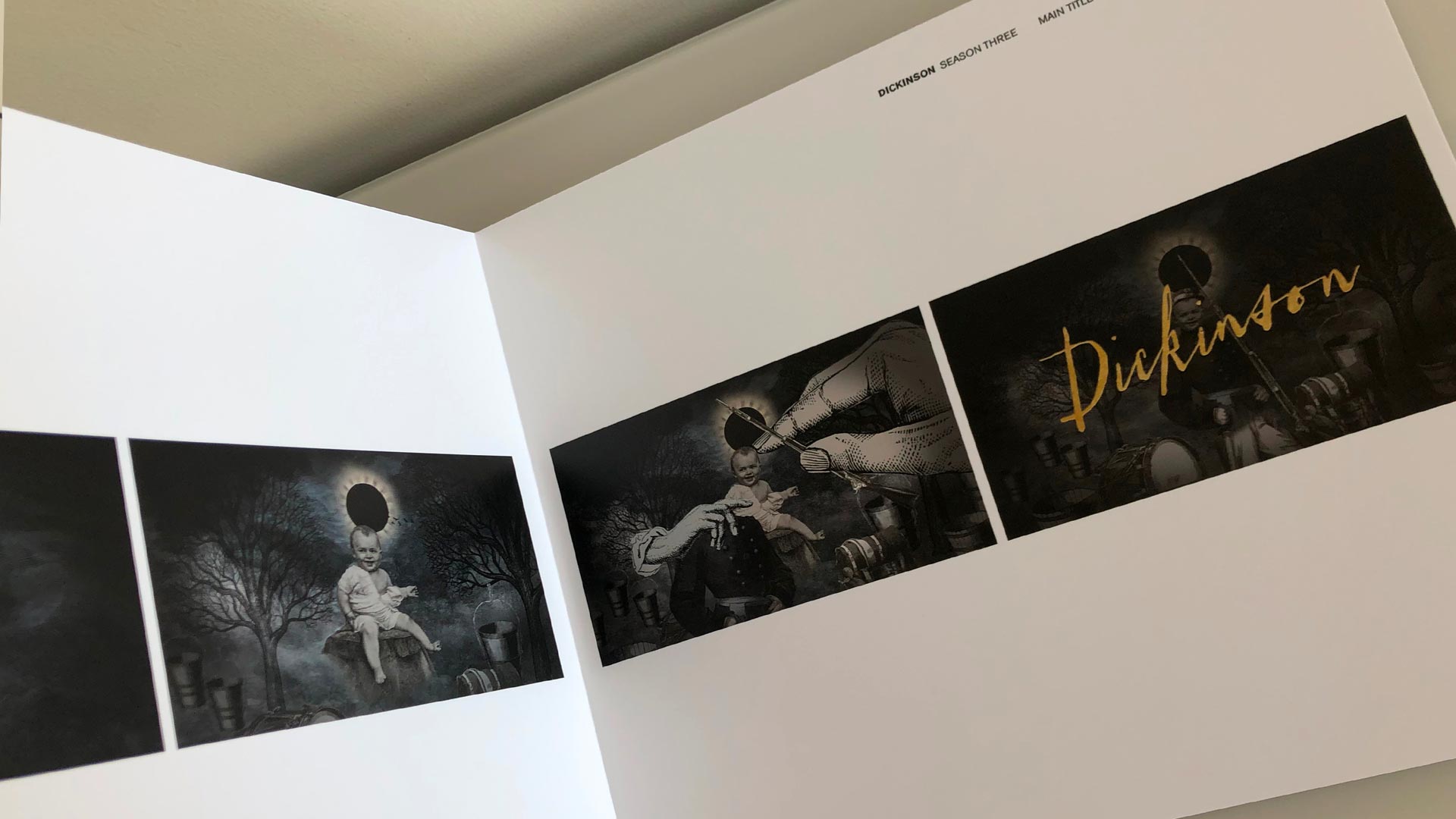
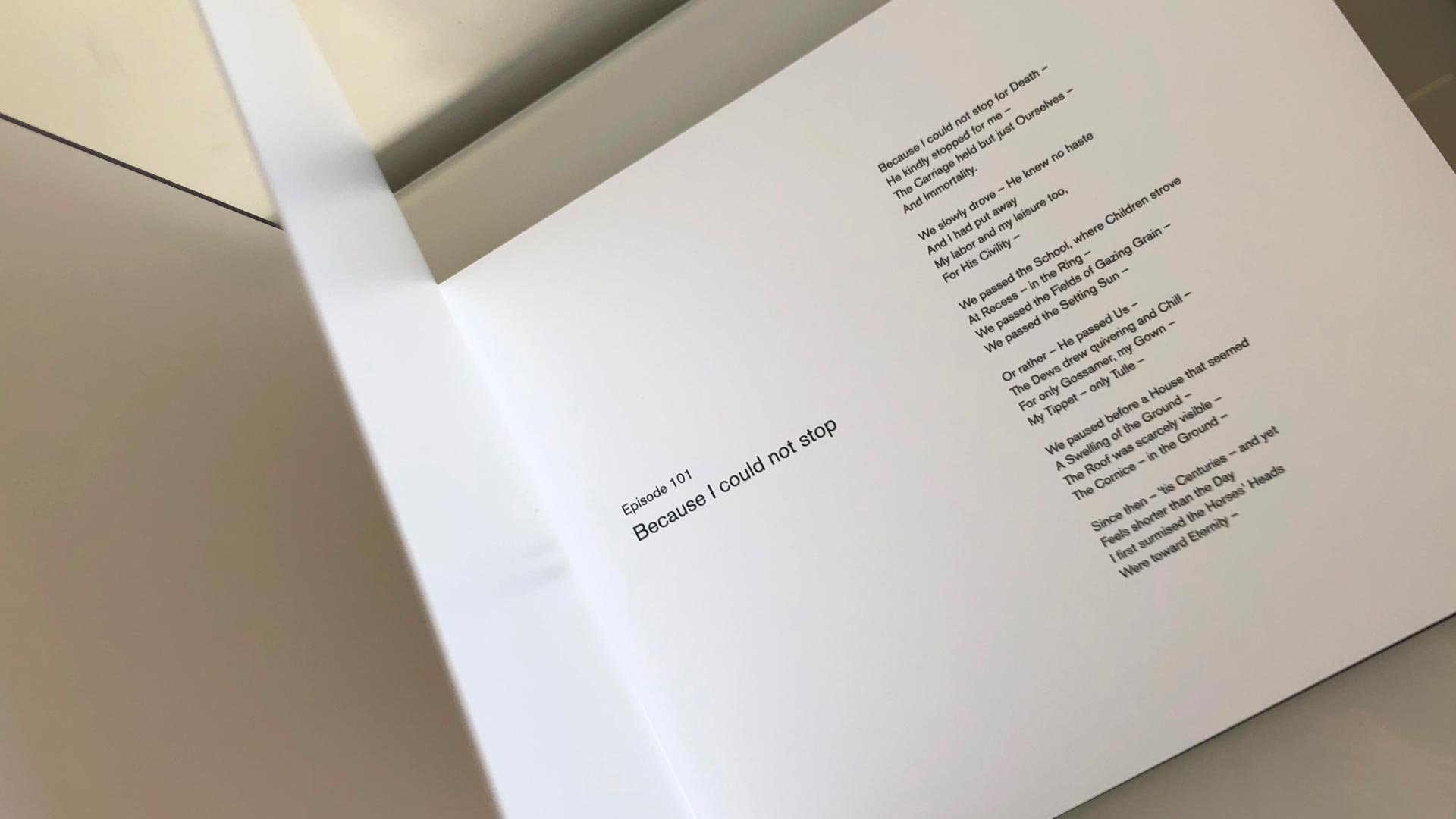
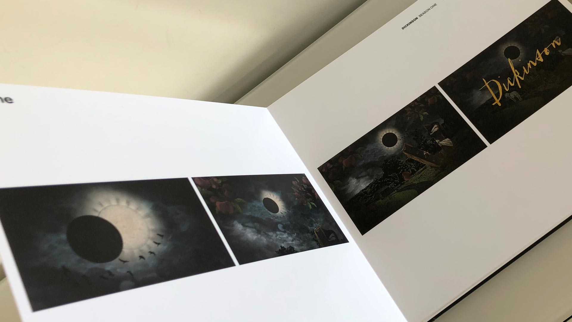
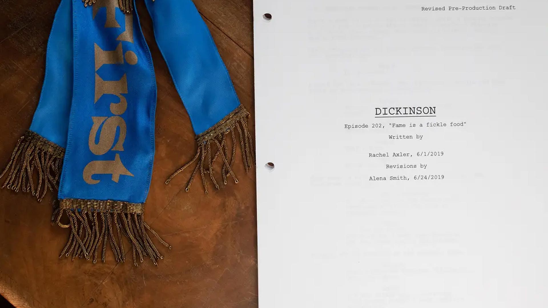
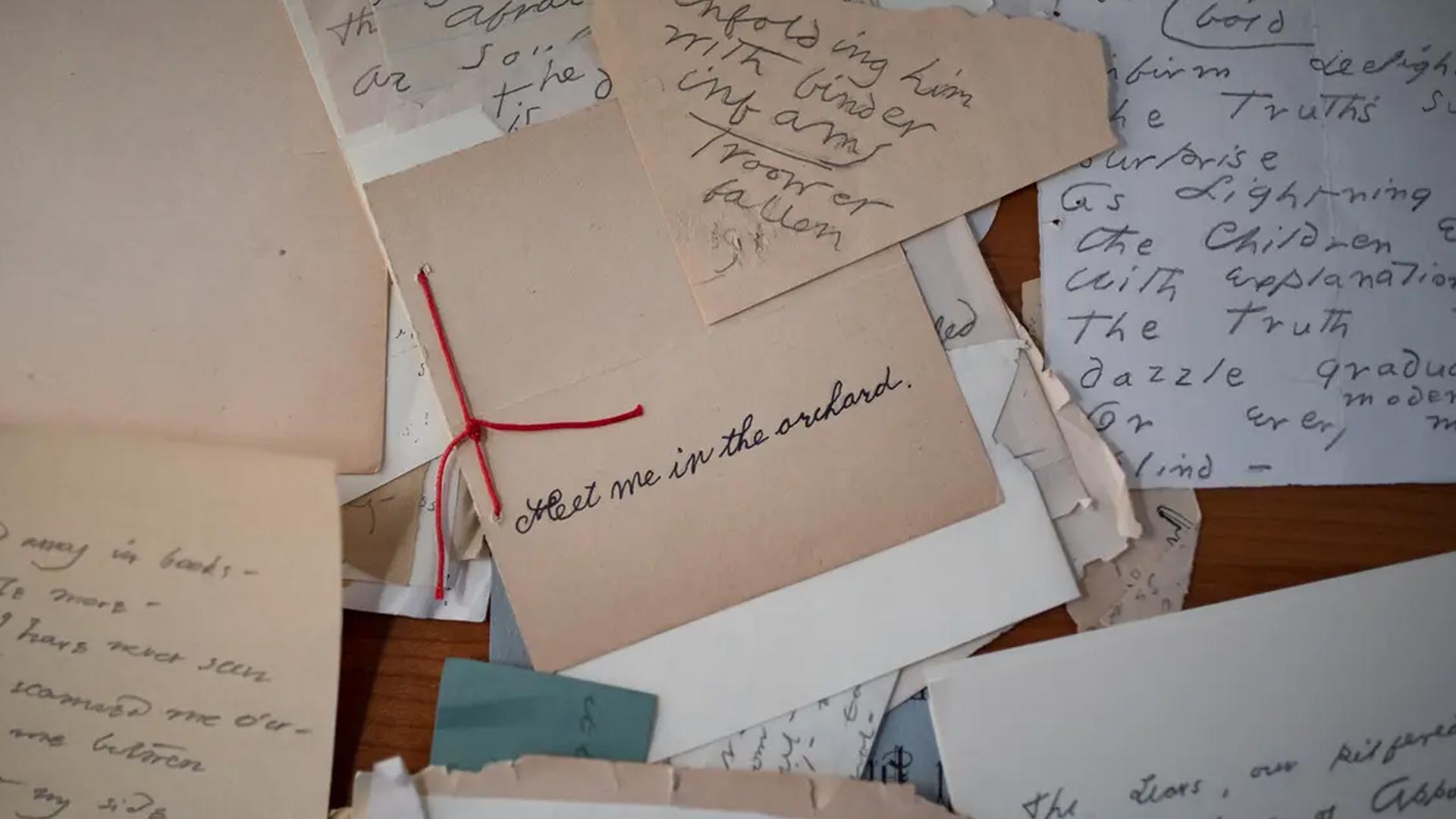
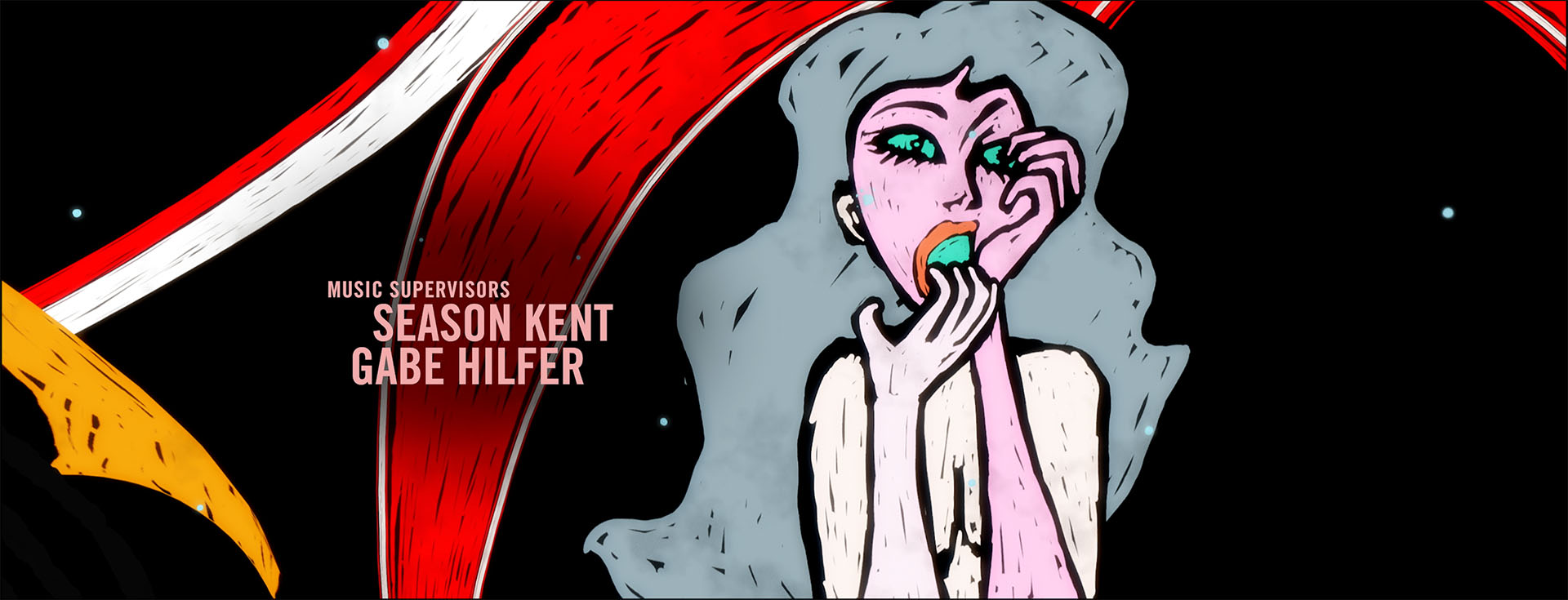
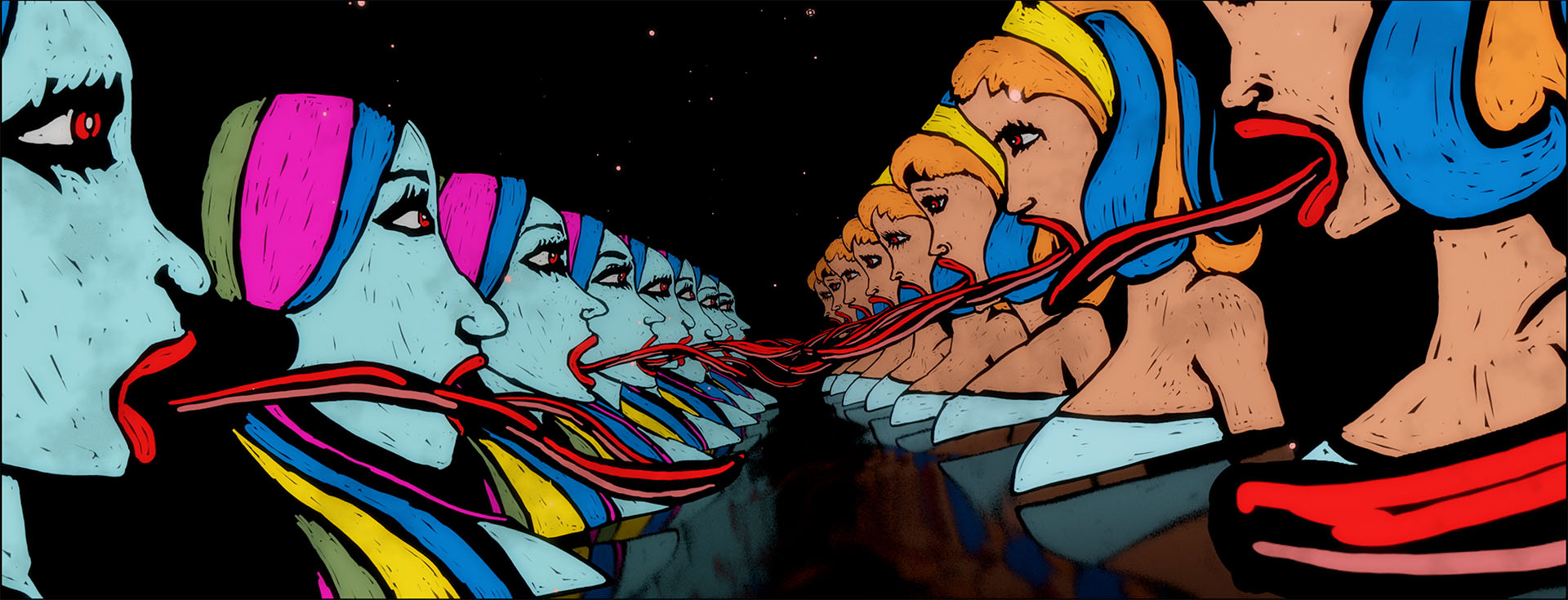
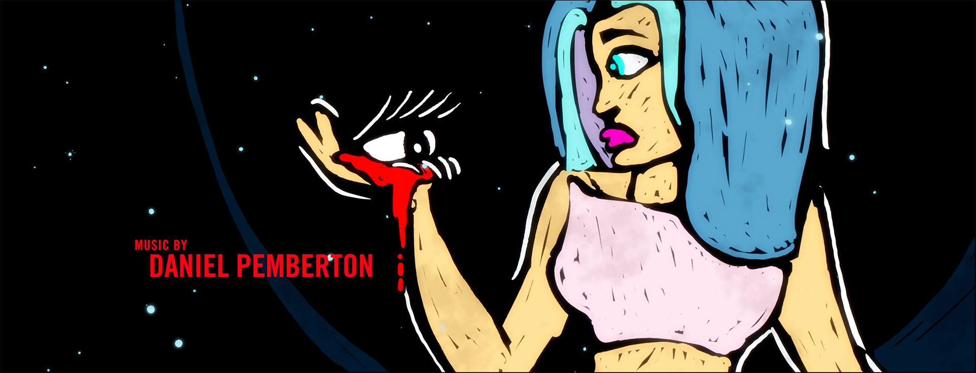
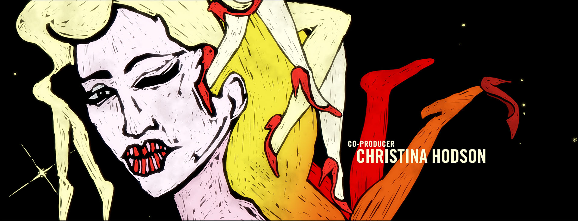
Shine designed and animated the main title sequence for “Dickinson”, an American period black comedy series about Emily Dickinson, created by Alena Smith for Apple TV+. Shine delivered thirty unique animated main title sequences, one short custom sequence for each episode. The idea uses a collage of illustrations and etchings that visually represent Emily Dickinson’s life, relationships and work.
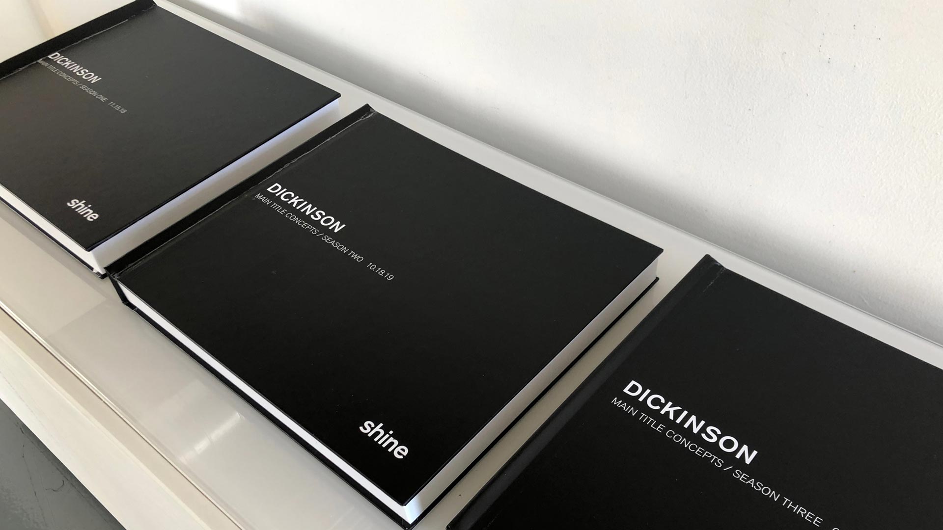
The “Dickinson” production team at Apple donated props, costumes, and other visual materials to the Emily Dickinson Collection at Harvard’s Houghton Library. Also included are all thirty main title sequence design storyboards, bound into hardcover books.
2023 Communication Arts Illustration Annual
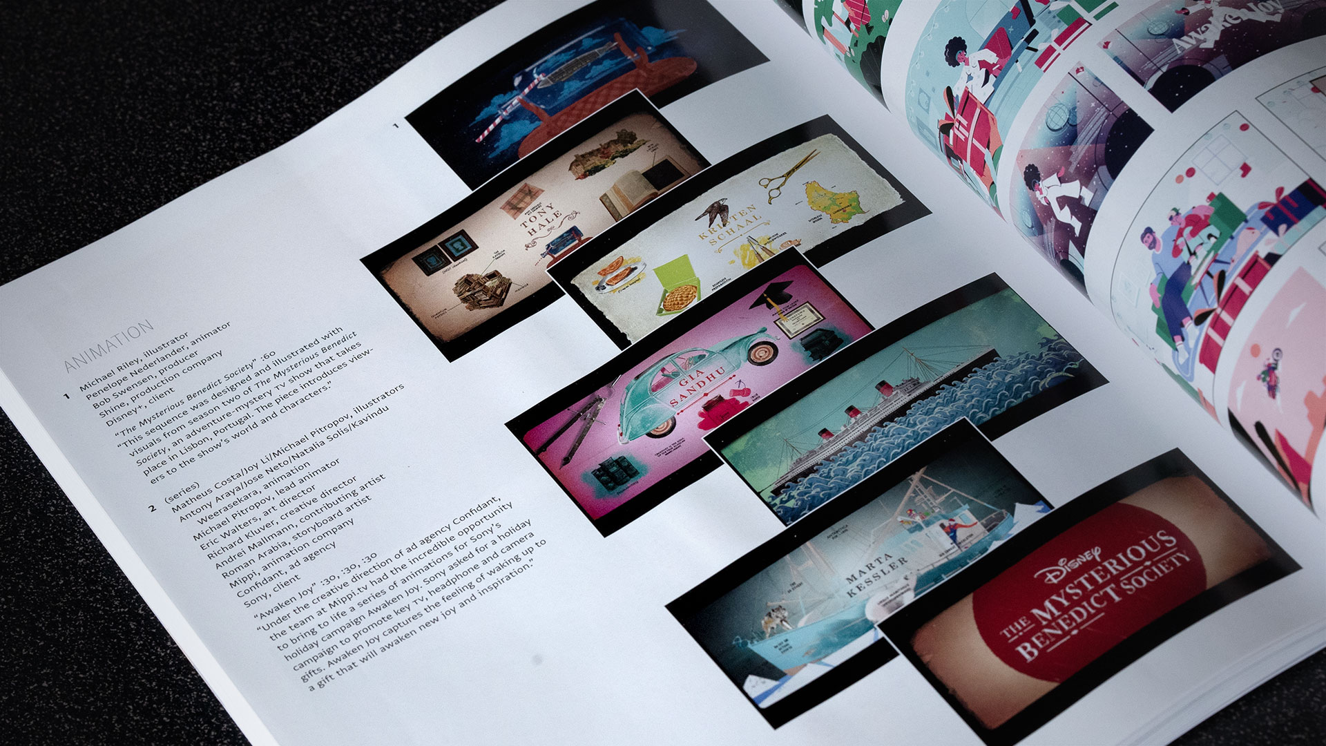
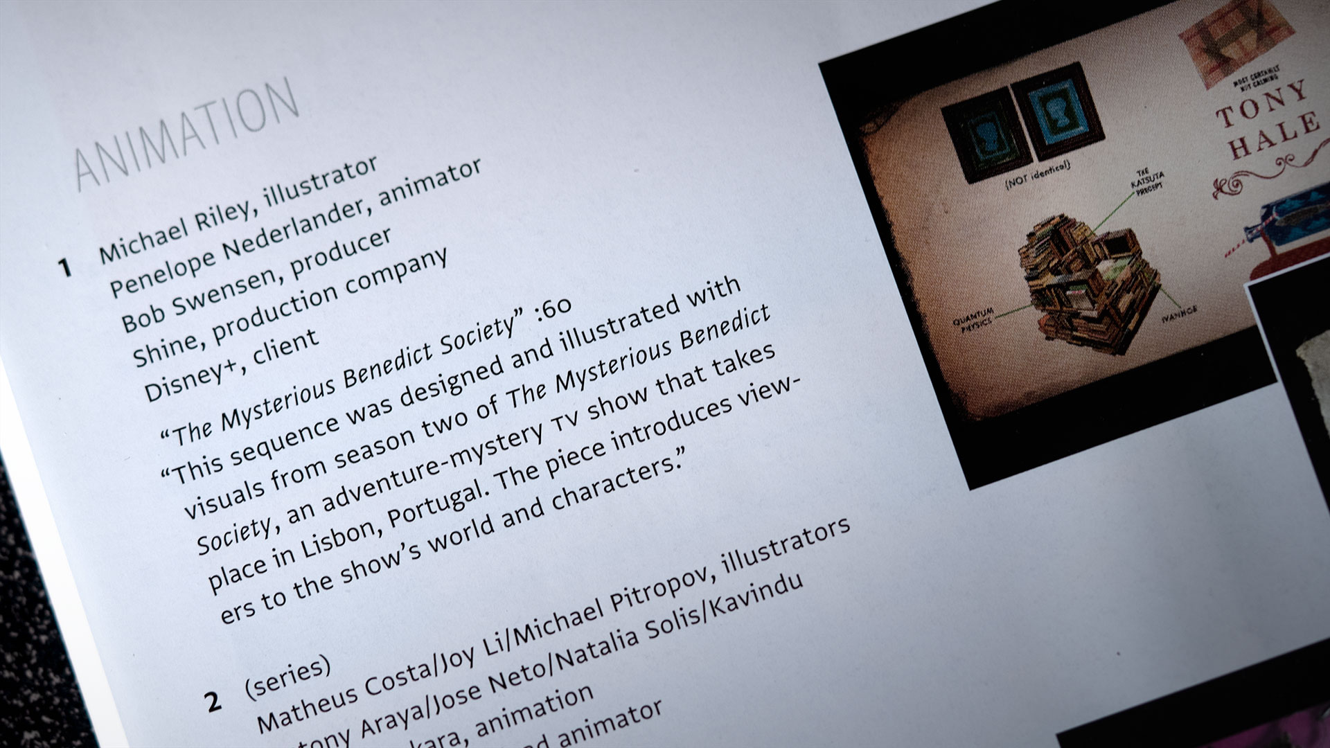
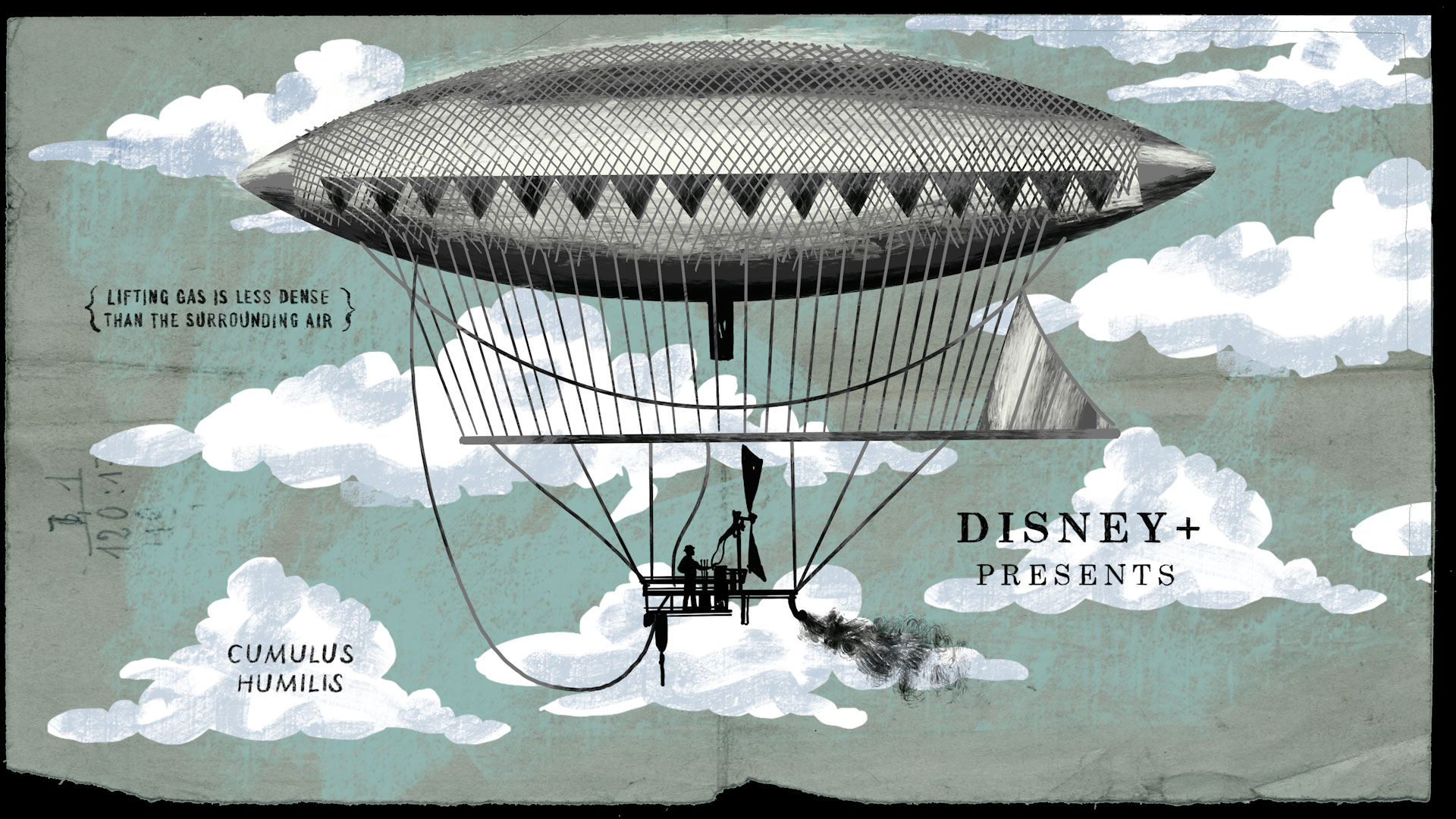
Thank you to the Communication Arts Illustration Annual Jury for including The Mysterious Benedict Society season one title sequence.
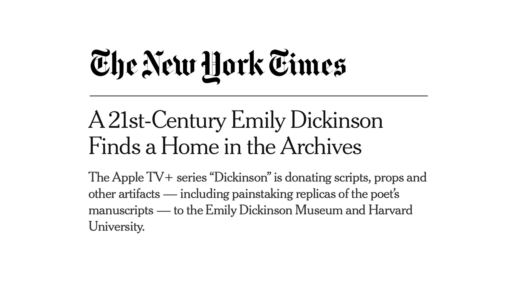
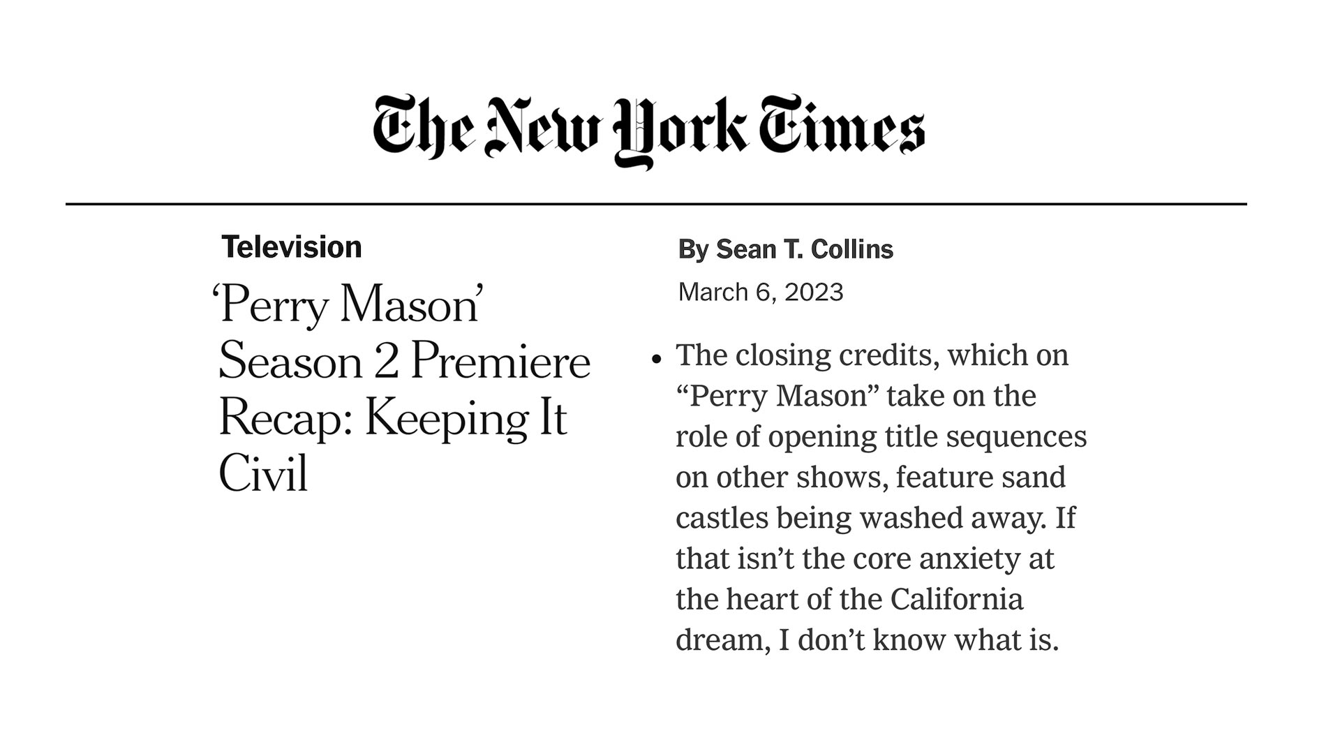
Thank you to Sean T. Collins for the shout outs in The New York Times Television Section!
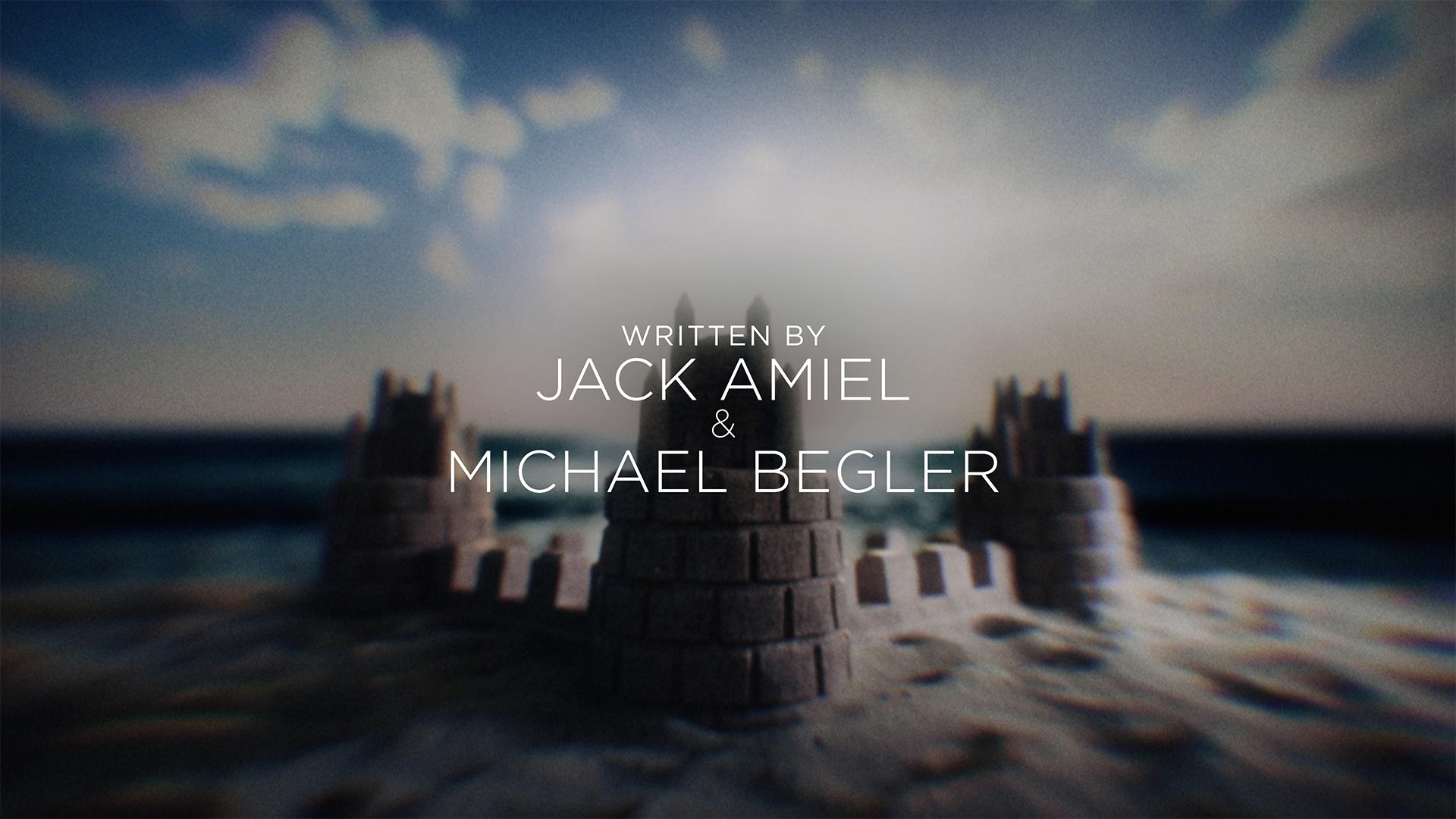
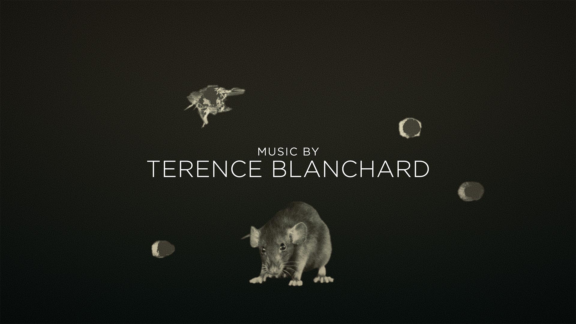
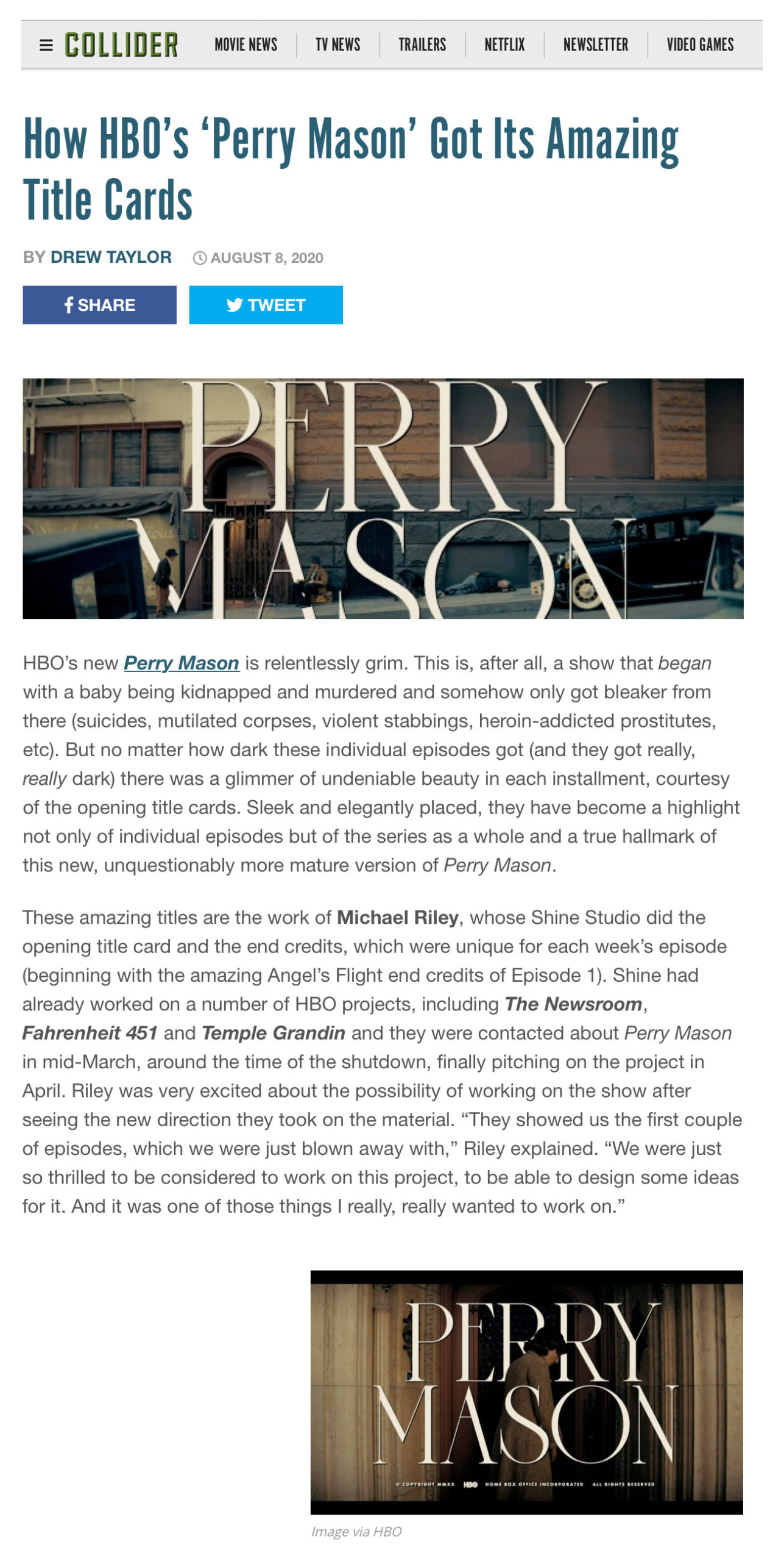
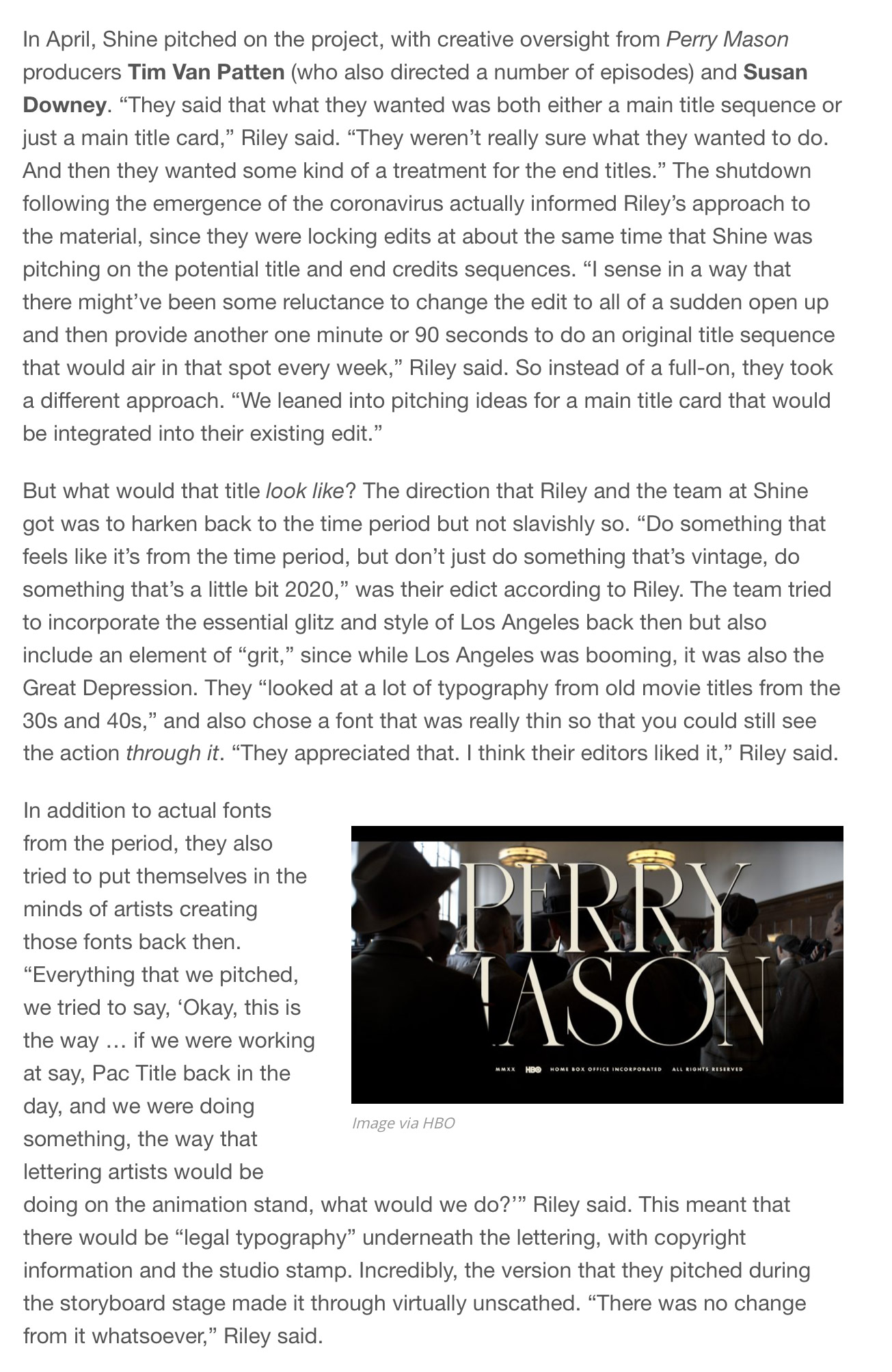
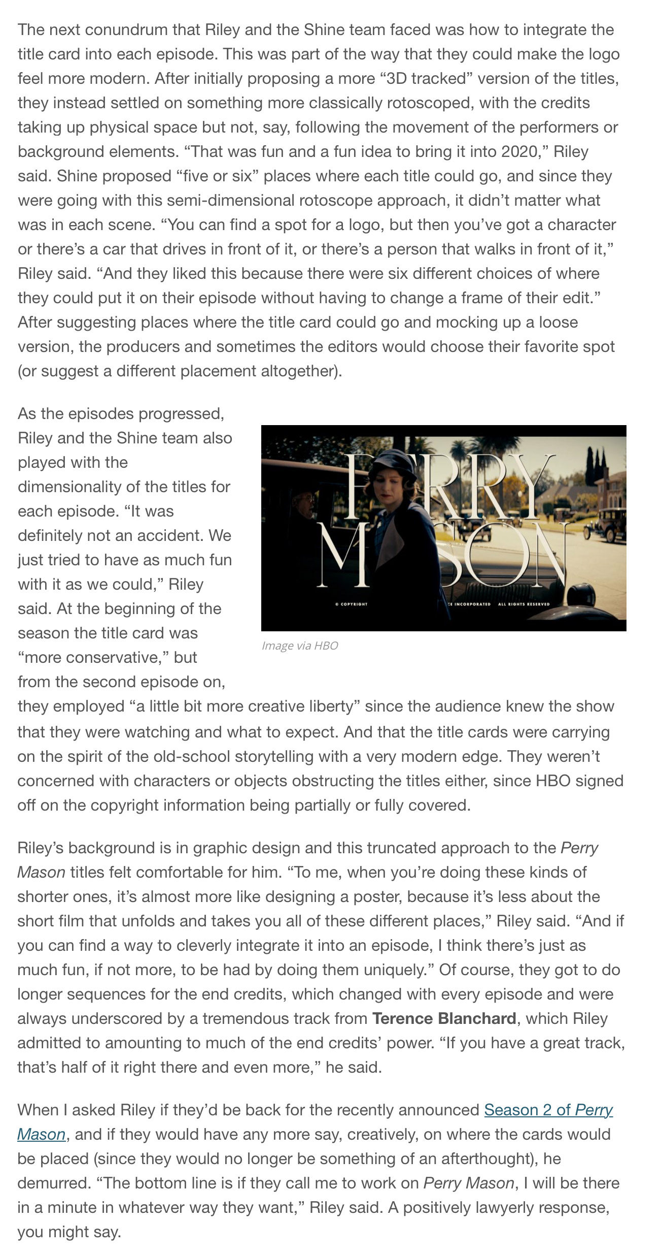
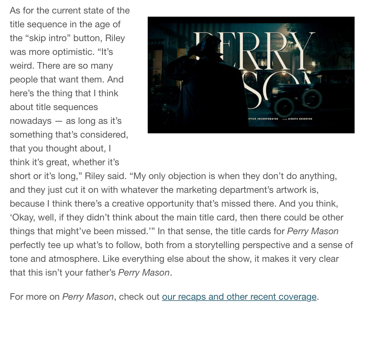
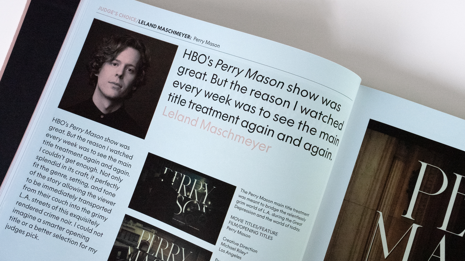
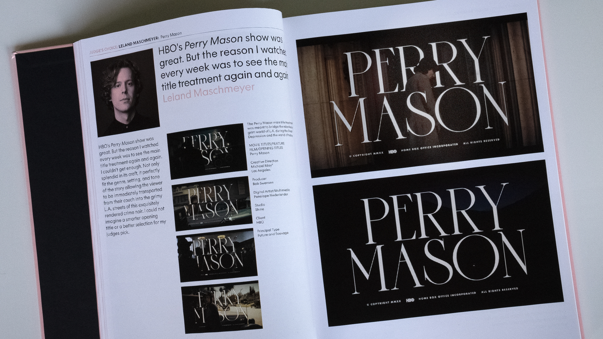
“Perry Mason” main title logo animations and eight unique end title sequences: Shine designed and animated the main title logo and eight unique end title sequences for Perry Mason. Each main title logo card, designed as if it were created on an animation stand in the 1930’s, was integrated into the scene using rotoscoping and 3D tracking. Each end title sequence was designed to specifically conclude each episode, serving as a visual punctuation as the final scene rings out.
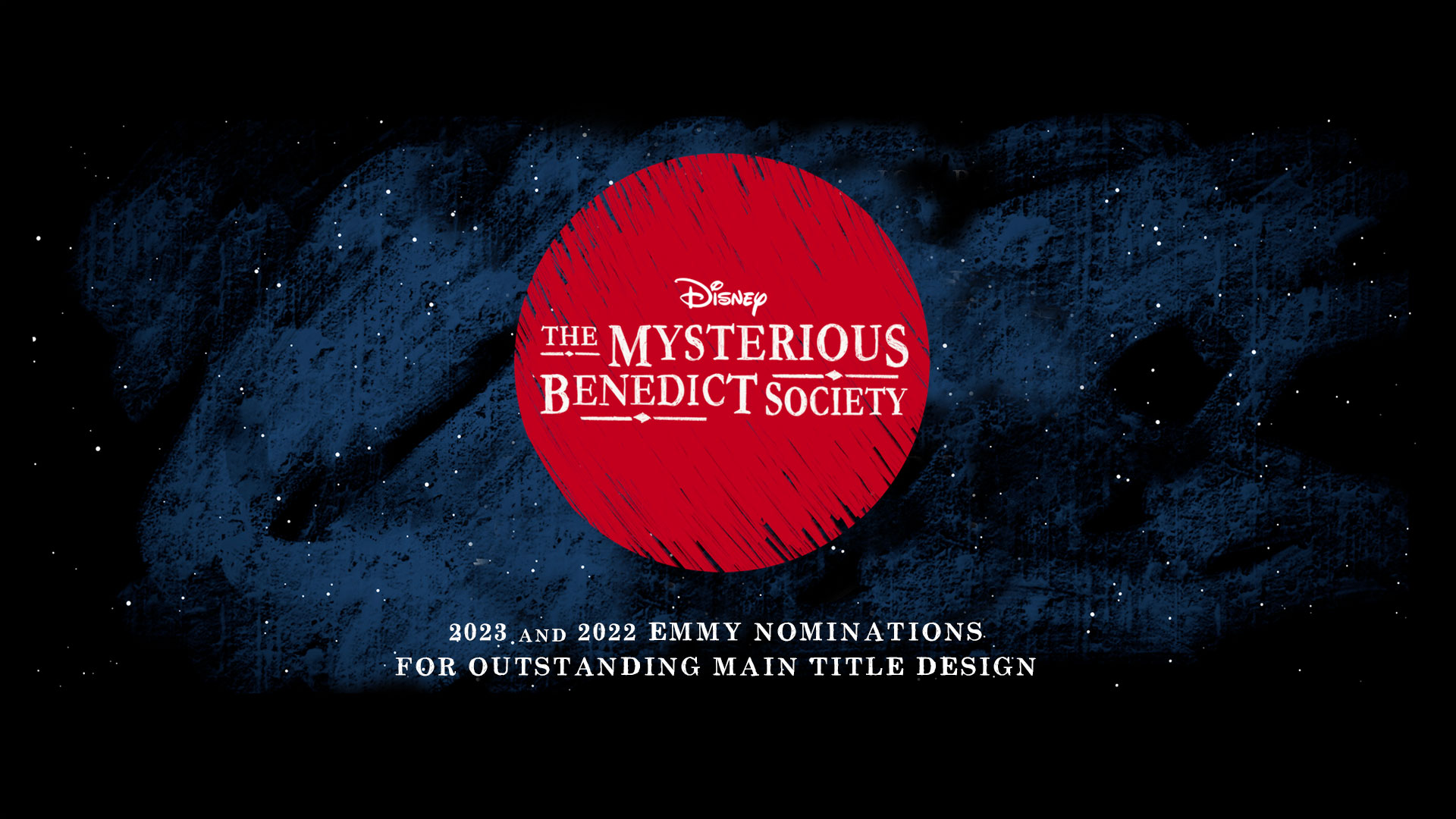
2023 & 2022 Emmy Nominations
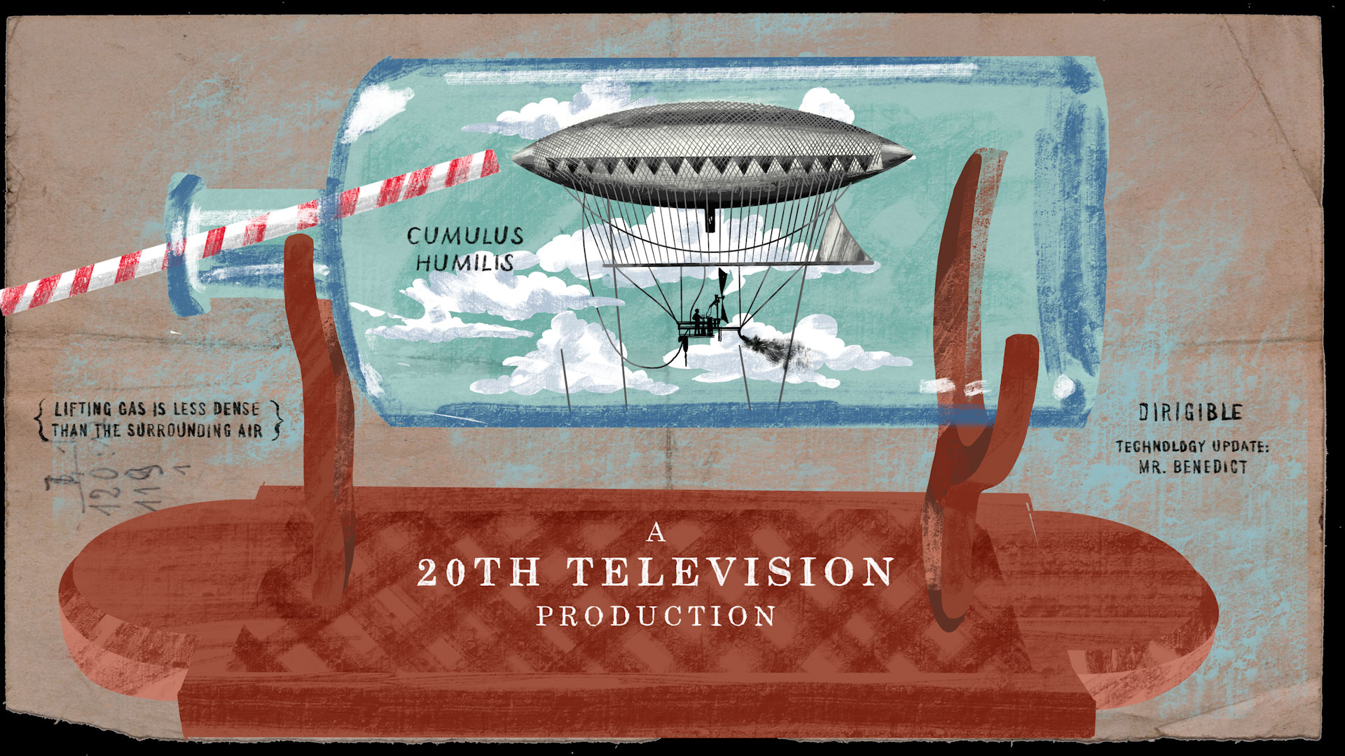
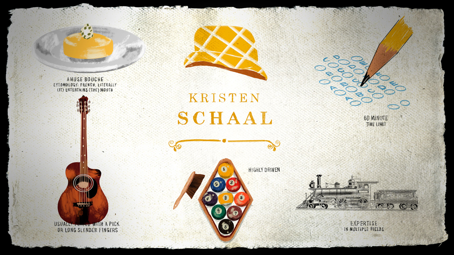
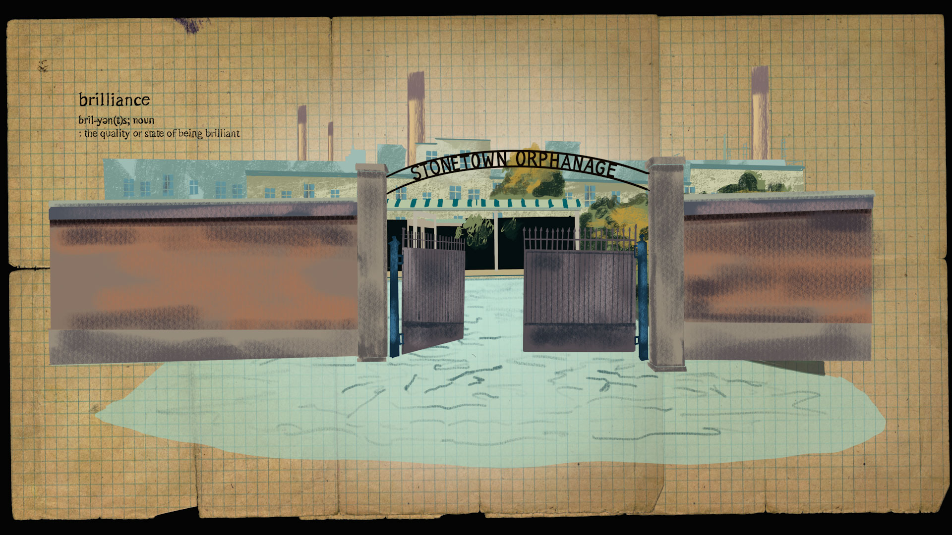
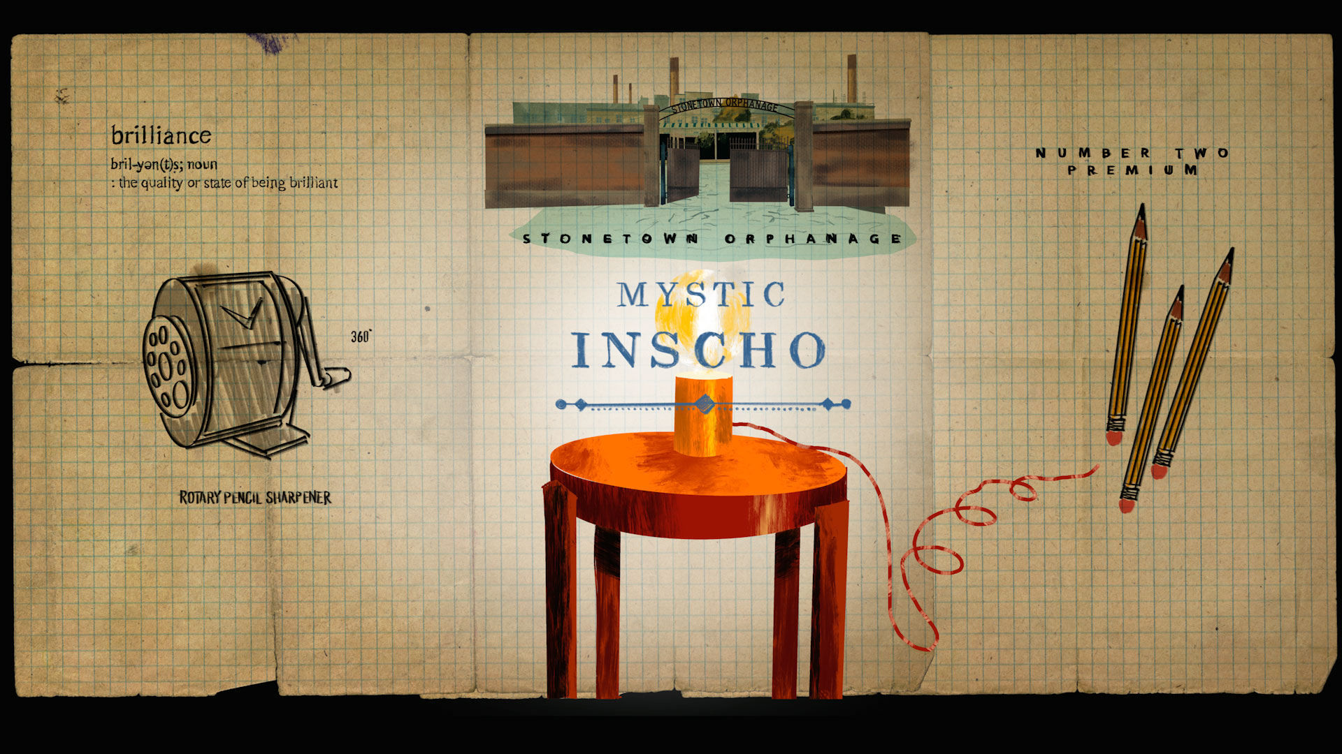
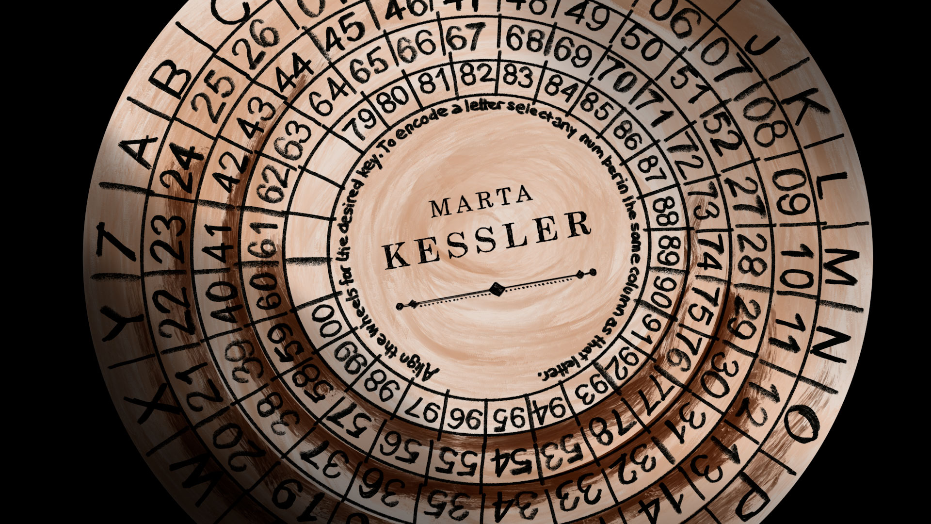
The National Academy of Television Arts and Sciences has a new category called the Children & Family Emmys, and the Shine team was nominated for Outstanding Main Title Sequence Design for season two of The Mysterious Benedict Society.
This is Shine’s second Children & Family Emmys Nomination. In 2022, Shine was also nominated for the season one main title of The Mysterious Benedict Society. Each season has a different main title sequence that’s unique to the unfolding story.
The National Academy of Television Arts and Sciences (NATAS) is an American professional service organization founded in 1955 for “the advancement of the arts and sciences of television and the promotion of creative leadership for artistic, educational and technical achievements within the television industry”. Headquartered in New York City, NATAS membership is national and the organization has local chapters around the country. It was also known as the National Television Academy until 2007. NATAS distributes several groups of Emmy Awards, including those for daytime, sports, and news and documentary programming.
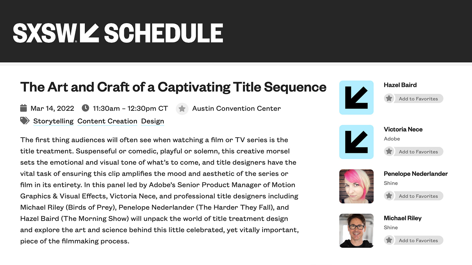
SXSW Design Panel sponsored by Adobe
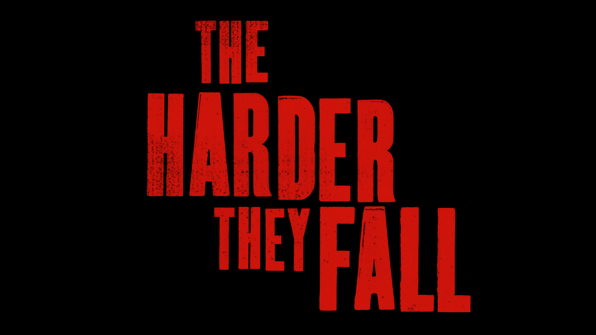
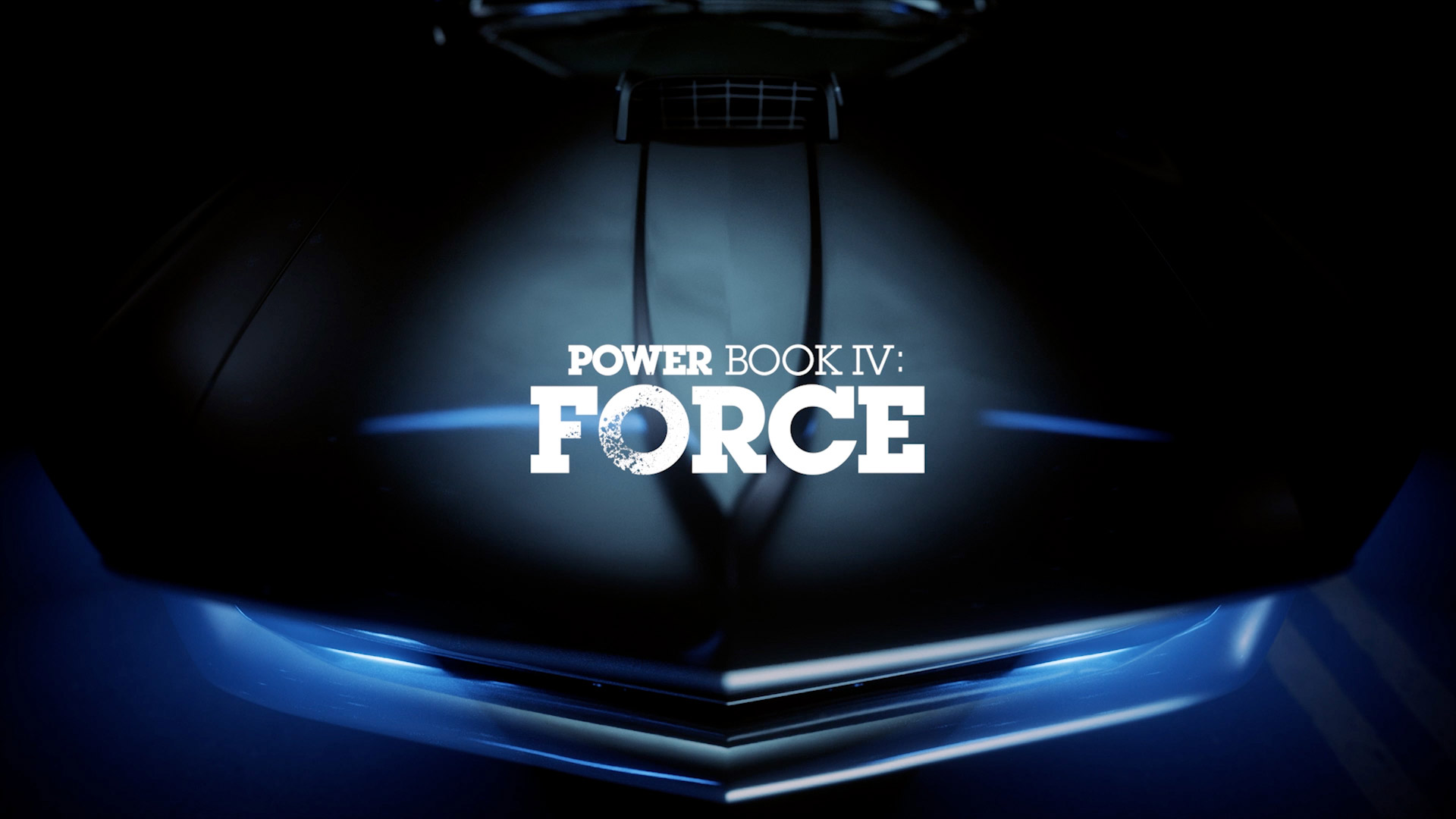
Thank you Adobe for hosting the panel that included Michael Riley and Penelope Nederlander. We showed two projects that were also finalists in the SXSW Title Design Competition, Power Book IV: Force and The Harder They Fall. We showed and discussed Birds of Prey, the previous SXSW 2021 Winner of the Special Jury Recognition and Audience Award in Title Design, as well as our work for The Mysterious Benedict Society for Disney.
Adobe Insights Interview
Thank you to Michelle Gallina, Kenna Alemania, and Laura Thurman for the interview!
By Michelle Gallina, September 15 2021
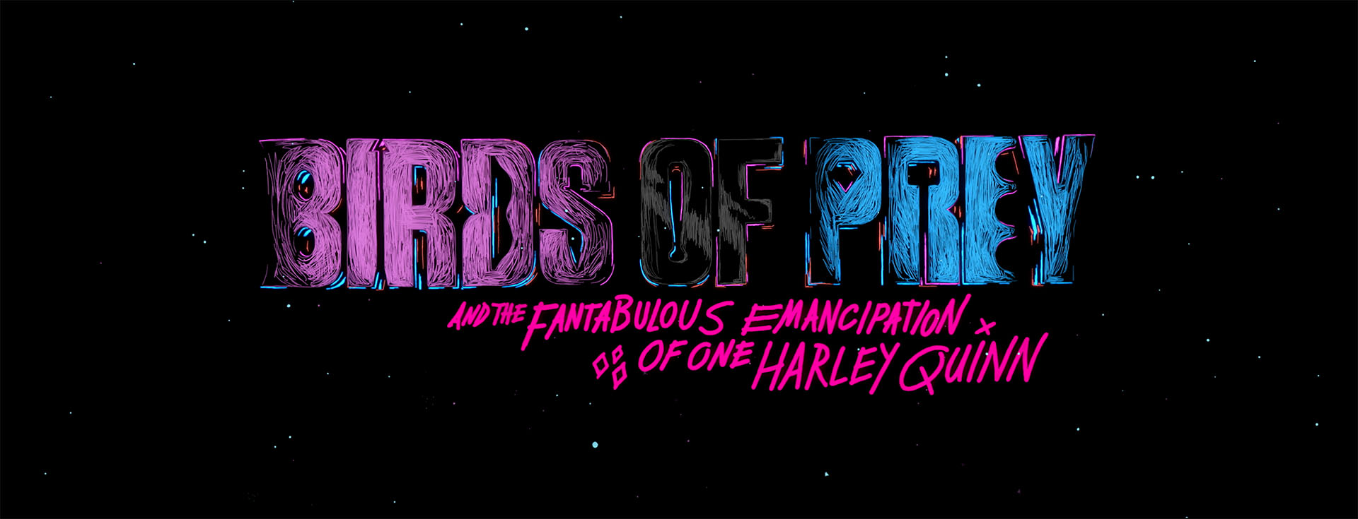
Talking with Shine’s Michael Riley about creating the pop animation titles for DC’s superhero movie “Birds of Prey”.
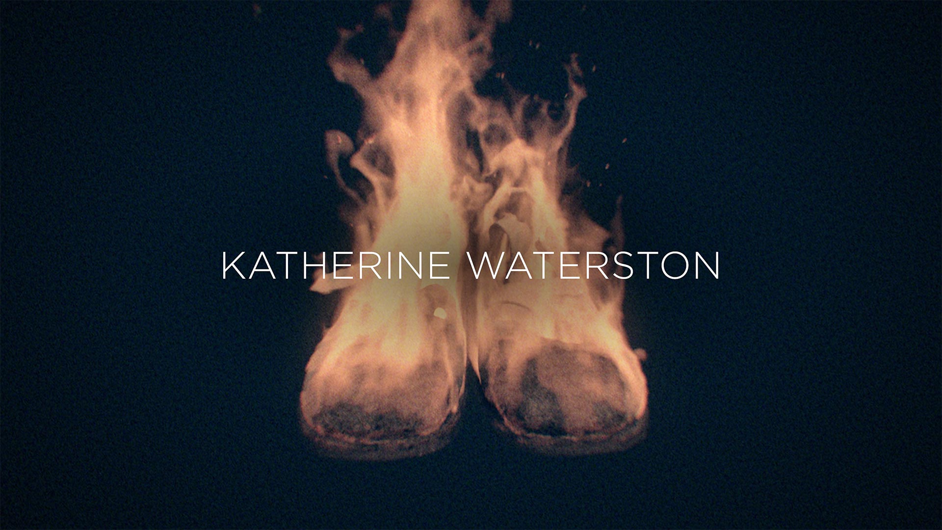
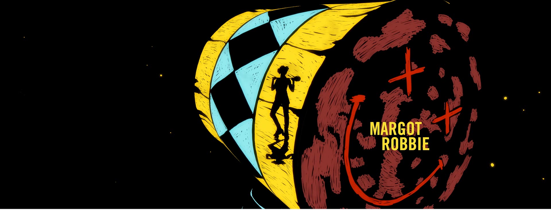
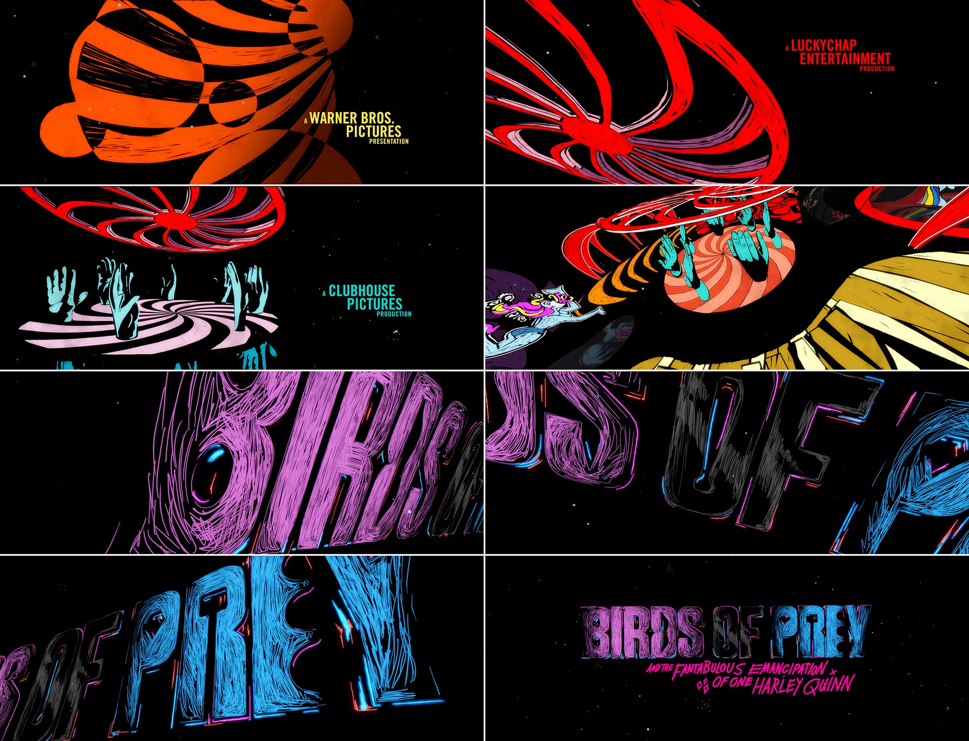
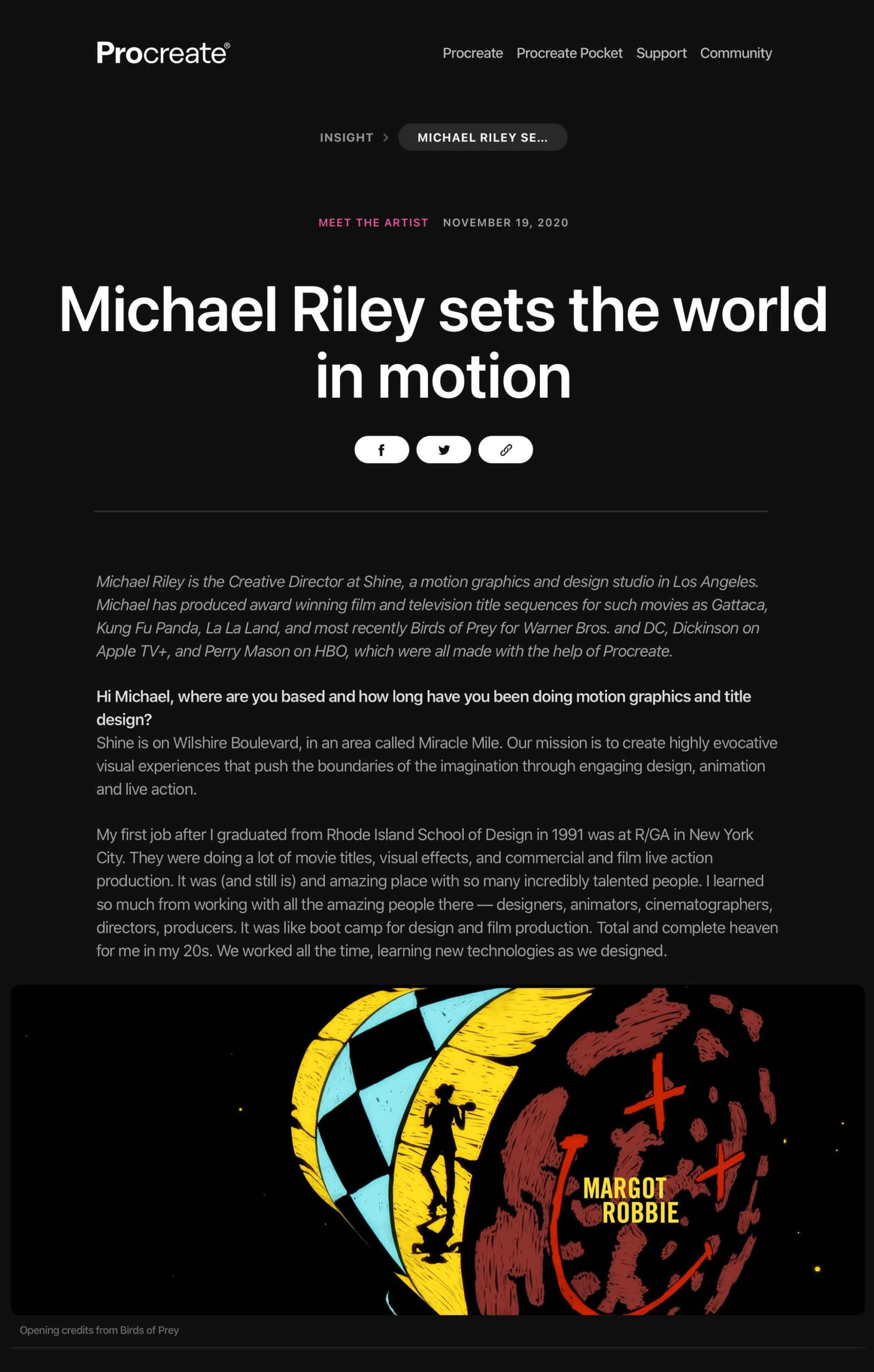
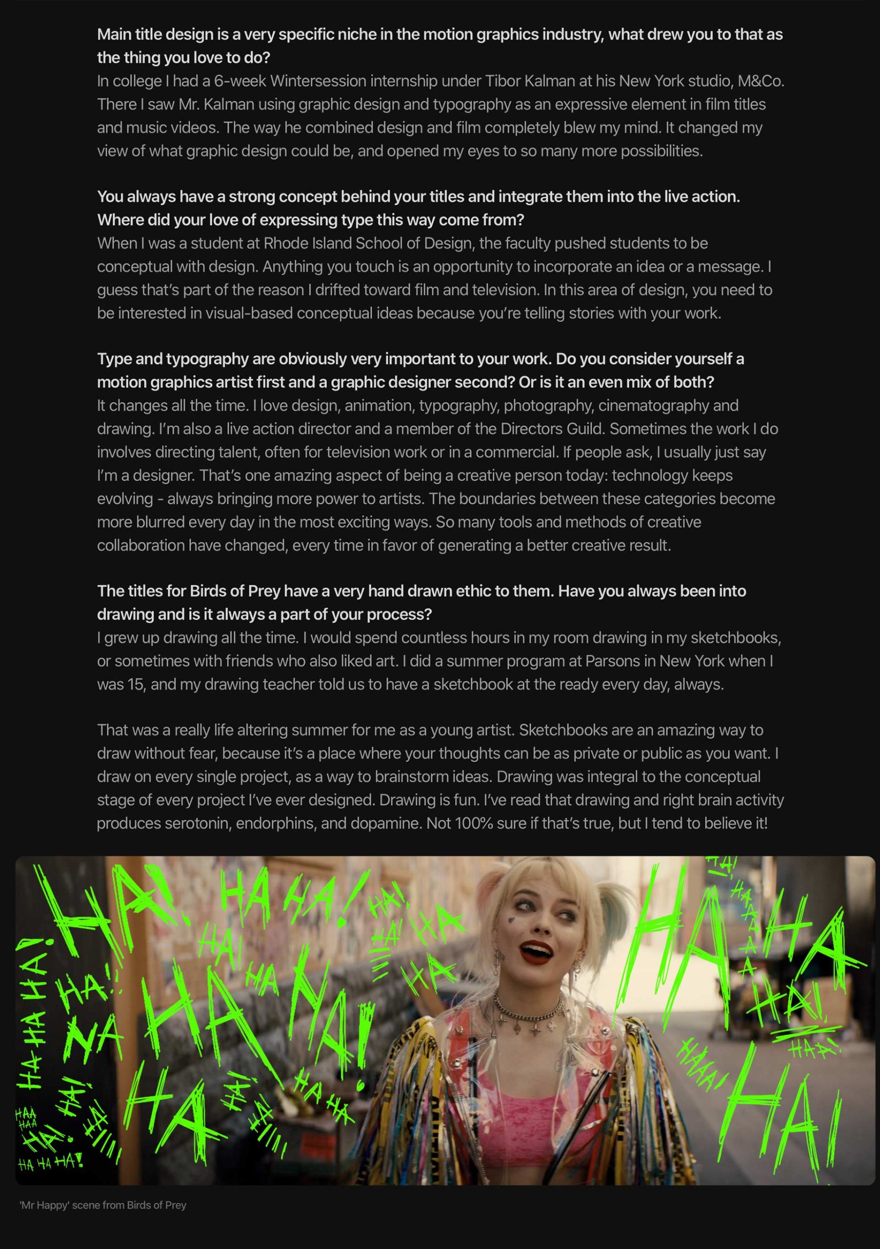
Bright and colorful, fast paced and rambunctious, “Birds of Prey” (and the “Fantabulous Emancipation of One Harley Quinn”) embraced the cartoon origins of its titular character, Harley Quinn. This 2020 film starring Margot Robbie earned praise for its fun style, which started with the opening title sequence. The titles use stylized hand-drawn illustrations that hint at the movie’s climactic finale while preparing audiences to enter the wild and colorful world of “Birds of Prey”.
The sequence was created by the inventive design team at design and production studio Shine. Shine was honored with a 2021 SXSW Special Jury Recognition for Title Design plus the Audience Award for the main title category for “Birds of Prey”. We sat down and talked with Shine’s Creative Director, Michael Riley, to learn a bit more about what goes into these inventive titles.
How did you first get into motion design?
When I was a student at Rhode Island School of Design, I did a six-week internship under Tibor Kalman at his studio M&Co. in New York. Tibor was finding all kinds of ways to break free of norms within graphic design. He used typography and graphic elements to express ideas and emotion in film titles and music videos. His use of motion for typography and graphic design in concert with film was something really exciting and different. His motion work was really groundbreaking, and it opened my eyes to so many more possibilities within graphic design.
Can you tell us about how you got started with “Birds of Prey”?
The project started with Bob Swensen, the executive producer at Shine, and me screening the movie over at Warner Bros. Then the director, Cathy Yan, gave us her creative brief. She wanted a title sequence that served as a visual punctuation for the movie and a graphic expression of Harley Quinn. She wanted us to design something that reflected Harley’s wild punk-rock character. Also, she really didn’t want something slick. Cathy thought maybe we could take some visual and conceptual inspiration from the fun house from the end of the film, where there was a big battle scene.
What was the main thing you tried to bring to the title sequence?
This project was all about Harley Quinn. The design of the title sequence was meant to be a visual expression of Harley’s character. She’s wild, strong, smart, compassionate, and very human. The title sequence’s visual style and some of the elements were inspired by the production design from the film. The movie was bold, bright, and colorful. For the tone of initial storyboards, I took inspiration from the spirit of Cy Twombly’s work, some of which consists of wild, expressive, bold, almost out-of-control scribbling. I thought that spoke to Harley Quinn’s character.
What was your favorite part about creating the title sequence?
For me it was all about the fun of drawing. I’m addicted to Procreate on my iPad, and the way Procreate seamlessly integrates with Adobe Creative Cloud — specifically Photoshop — made the process really enjoyable, because I was able to focus on the visual ideas and not worry about the tools. It was a very intuitive process. I spent many weeks drawing and illustrating as many visuals as I could that were inspired by the film.
I’ve always used drawing as a tool to come up with ideas, but I don’t always use illustration in the final animation. I think a title sequence should reflect the characters and the story of the film, and in this case, using wild colorful illustration seemed to be a good fit.
What were some challenges you faced when making the titles?
The main challenge is designing so that we’re speaking to the characters and the story. Every visual we incorporated needed to be an extension of the characters, the conflicts, and the relationships in the film. So that meant the design process was fluid and constantly adjusting so that the title sequence was serving the film as a visual punctuation that tied into the story.
One thing I really love about designing for movies is that film is a collaborative medium. Between the team at Shine that’s animating the project; the director, Cathy Yan; the producers; then the studios executives at DC & Warner Bros… there are a lot of people you get work with. With this kind of collaboration, you need to be flexible. Adobe Creative Cloud is absolutely built for this kind of project.
While the titles use hand-draw illustrations, there’s also real depth. Was there any 3D work involved?
Yes, some shots were animated using 3D cameras in After Effects, and some were created by modeling 3D environments in Cinema 4D. Penelope Nederlander, the lead animator on this project, did some really amazing work on “Birds of Prey”. She brought deep knowledge of both After Effects and C4D and combined the Procreate illustrations into a hybrid 2D-meets-3D aesthetic that the clients really loved. Animators Amanda Gotera and Myke Chapman did amazing work too. The production process was a team effort between all of us, and we had a great time collaborating. I think each of us brought something different to the table — that was a definite plus.
Walk us through the production process. How did you bring these titles to life?
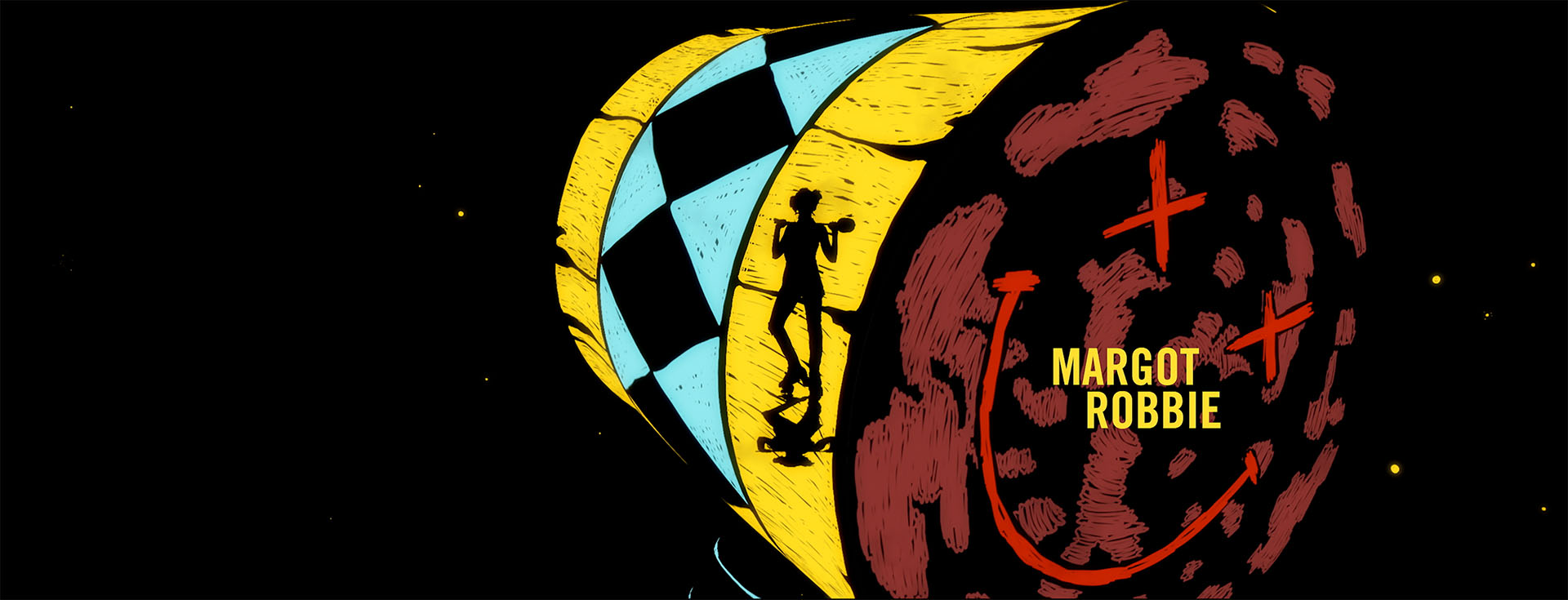
The production phase was so much fun. Adobe Creative Cloud was key to creating this sequence. I drew all the illustrations in Procreate in my iPad, and then exported to Photoshop to create storyboards. We created a storyboard presentation in the form of a PDF assembled using InDesign. For the client presentation, we projected each storyboard frame separately in the screening room over at Warner Bros. for the director Cathy Yan, and the producers, Margot Robbie, Sue Kroll, and Bryan Unkless. This helped give the storyboard presentation a bigger, more cinematic feel.
Once they approved the concept, we started really rough. I simply cut together Photoshop still frames in Premiere Pro against the music. That established which Procreate illustrations we were going to use. We then advanced to animation with After Effects and Cinema 4D. The ability for Adobe Creative Cloud to interface with all the Procreate illustrations was really key on this project. It took us all the way to delivery, where we exported the final 5K frames out as EXR frame sequences for delivery.
Last but not least, I need to mention fonts! There are so many great fonts and talented font designers that are part of the Adobe type library. The condensed bold option of Trade seemed to be a good fit because its voice kind of yells. I felt that was a choice that was in sync with Harley Quinn’s character.
What’s your favorite thing about working with Adobe Creative Cloud?
Adobe Creative Cloud can interface so fluidly between apps: Photoshop, Illustrator, InDesign, Premiere Pro, After Effects, Media Encoder, and many others. The way an artist can jump back and forth between each makes the creative process so intuitive and so much fun. There’s no other set of apps that compares. Some artists might have strengths in one over the other. But every app is both very intuitive for the beginner yet extremely deep for experts.
Also, I love that Adobe has always been open to integrating with other software. I talked about how we used the integration between Procreate and Photoshop for this project. And Penelope is amazing in Cinema 4D, and there’s a very fluid relationship between C4D and After Effects. Adobe Creative Cloud does a great job of being useful to creatives wherever they are in their path, in terms of both creative focus and skill level. As an artist, I can’t imagine designing without Adobe Creative Cloud.
Where do you find your creative inspiration?
My answer on this is a little all over the place! I like to be inspired by all kinds of art, design, music, and movies. I love to find new artists and photographers on Instagram or other places. I love movies, old and new. Lately I’ve been rediscovering a lot of art and design that I studied in art history at RISD. I also take a lot of inspiration from music. I can’t wait to get back to LACMA, MoCA, and all the New York museums. I also take a lot of inspiration from the talented people I have the opportunity to collaborate with!
What’s the toughest part about your design work?
Every time, the initial conceptual design phase is the most challenging part. If you’re working in movies or television, it’s always about designing and authoring ideas that fit the story. It’s also the most exciting part because the possibilities are wide open!
What advice do you have for people aspiring to get into the motion design space?
Treat any design opportunity as a gift. Cherish clients that bring you any creative opportunity. Work hard. And stay persistent!

We’re always interested to learn how people work. Can you tell us a bit about your workspace?
Shine is located on the sixth floor of a grand old Art Deco building on Wilshire Boulevard in an area called Miracle Mile. I love our studio space because we have amazing views of Los Angeles on all sides. I love to design in the studio at Shine!
See more of Michael Riley’s work on his website, shinestudio.com.
Thank you to Leland Maschmeyer, Co-Founder of Collins, and former CCO at Chobani for the TDC67 Judges’ Choice Award, and for the generous words and about the Perry Mason main title design. We feel honored to be included in the Type Directors Club 67th Annual Competition. The team that contributed to Perry Mason includes Michael Riley, Penelope Nederlander, Aaron Bjork, Kate Mrozowski, and Bob Swensen.
This year’s TDC67 Communications Design Competition featured more than 1,500 entries from 66 countries. Only 254 entries were selected as this year’s top winners. In addition to the winning work, 13 TDC judges selected their Judges’ Choice, which are featured in a video as well as in the front of this year’s The World’s Best Typography®, Typography 42 annual.
“Perry Mason” main title logo animations and eight unique end title sequences: Shine designed and animated the main title logo and eight unique end title sequences for Perry Mason. Each main title logo card, designed as if it were created on an animation stand in the 1930’s, was integrated into the scene using rotoscoping and 3D tracking. Each end title sequence was designed to specifically conclude each episode, serving as a visual punctuation as the final scene rings out.
SXSW 2021 Film Awards
Thank you to SXSW for both the Special Jury Recognition and the Audience Award for the Birds of Prey and the Fantabulous Emancipation of One Harley Quinn in the Title Design category.
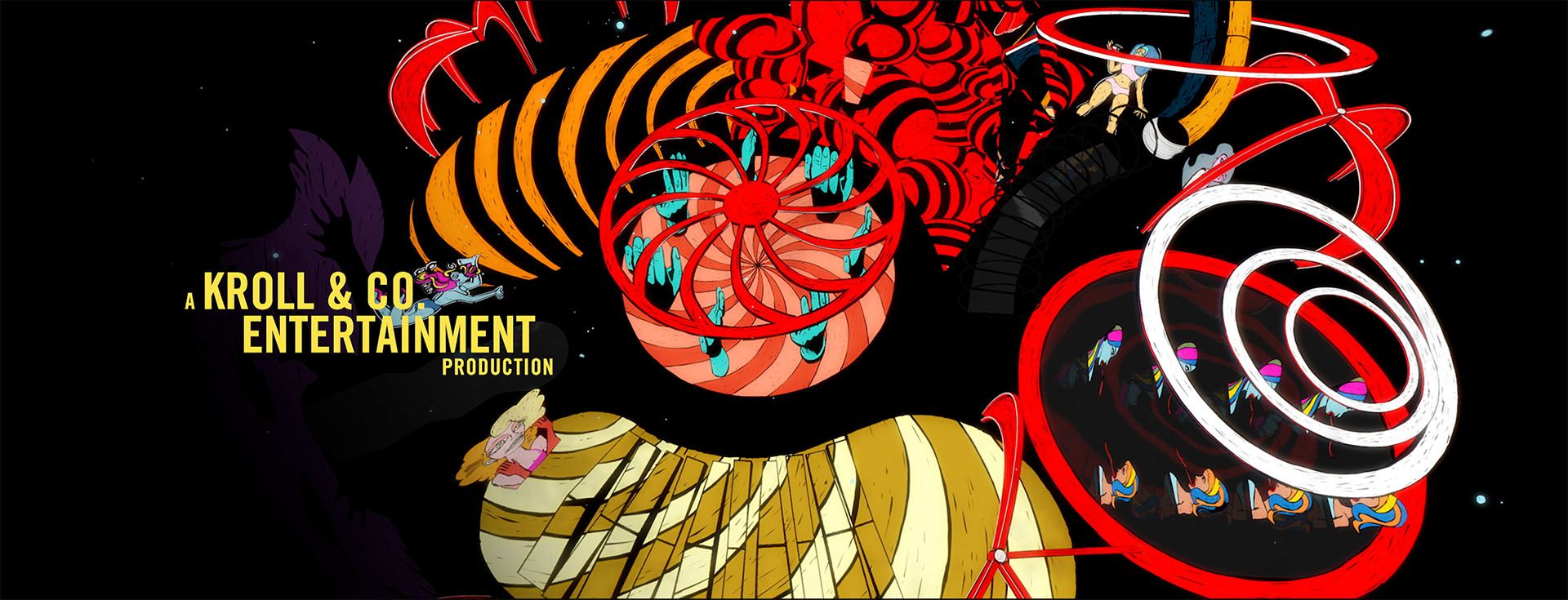
Shine designed, animated and produced the main on ends title sequence and “grievance” graphics for “Birds of Prey”. For the title sequence, Shine created unique, hand drawn illustrations of the wild sets for a dynamic, animated reprise of the film’s climatic ending. For the grievances, hand drawn, character based graphics were created and animated as expressions for the villains.
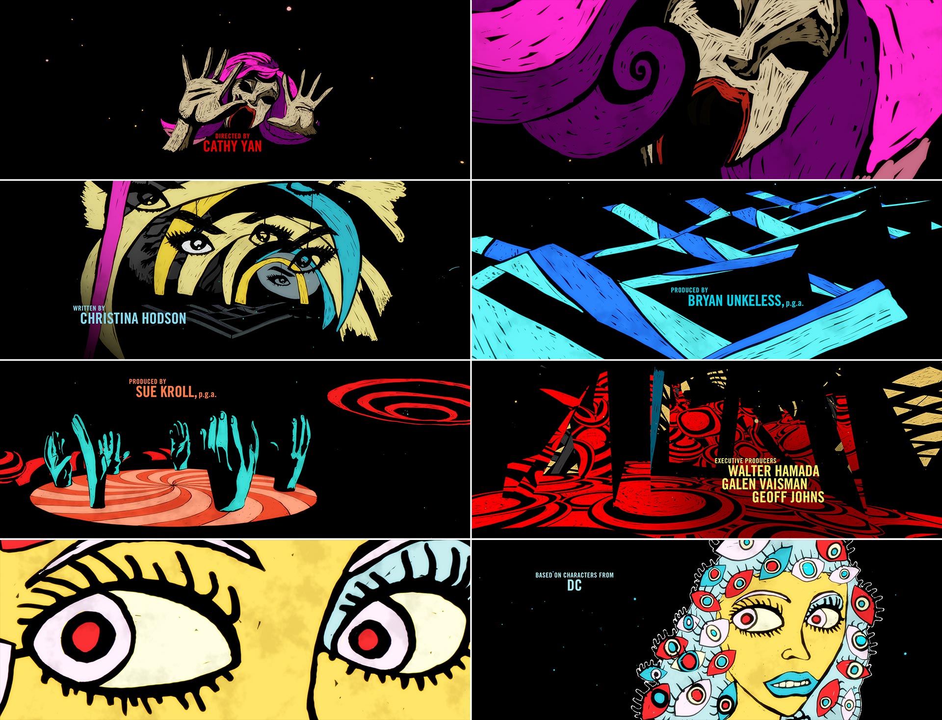
Each character is represented by a graphic image that represents their strength. For Harley, her icon was the sledgehammer. For Huntress, it was the crossbow – as she was known by Gotham as “The Crossbow Killer. Canary used a canary, or a “songbird” as her strength was her voice. Montoya, the cop, was represented by the badge. Cass had the stuffed beaver from Harley’s apartment. And Roman Sionis was placed in front of the red stage in his nightclub.
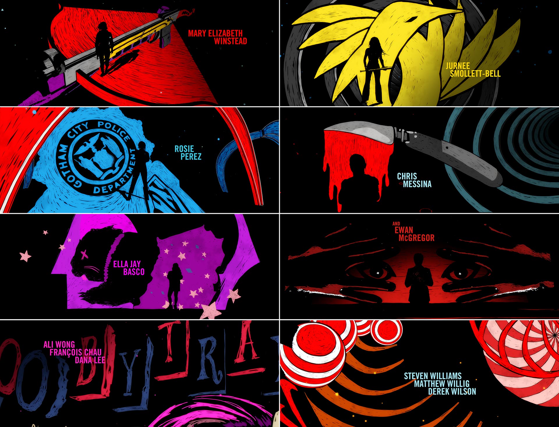
A femme force to be reckoned with, the Birds of Prey is traditionally an all-women group of vigilante operatives who’ve gone on covert missions across the globe. Originally a partnership between Black Canary and Oracle, the team’s roster has grown over the years to include friends—and frenemies.
Meet the Artist Interview
Thank you to Warrick Sears and everyone at Procreate for the interview!
Collider Feature Article
Thank you to Drew Taylor at Collider for the article about the Perry Mason main title sequences design!