Communication Arts Magazine
The Shine team thanks Communication Arts Magazine Editor at Large Julie Prendiville Roux for the generous words in her eight page feature. Below is the published article.
Written by Julie Prendiville Roux for Communication Arts Magazine.
The game of baseball plays a major role in Michael Riley’s life. He’s not only a coach for his sons’ teams every year, he keeps an actual baseball within reach most of the time. Like now–in the editing suite of his motion graphics house, Shine, Riley rocks a baseball from palm to palm with ease. “Baseball is a great metaphor for life,” he says. “The enjoyment should come from playing the game, not just winning. Even the best batter hits only three out of ten. When we don’t get a project we want, I say, ‘well, we still don’t have a bad batting average.’”
Riley, who grew up in Palo Alto, California, never played team sports as a kid. His recreation of choice involved a skateboard. “Soaking in sports the last few years has taught me a lot about being in an office,” he says. “Woody Allen once said that when he goes to a basketball game, he feels all the emotions he feels when he sees a good movie. That’s what sports has done for my design life.”
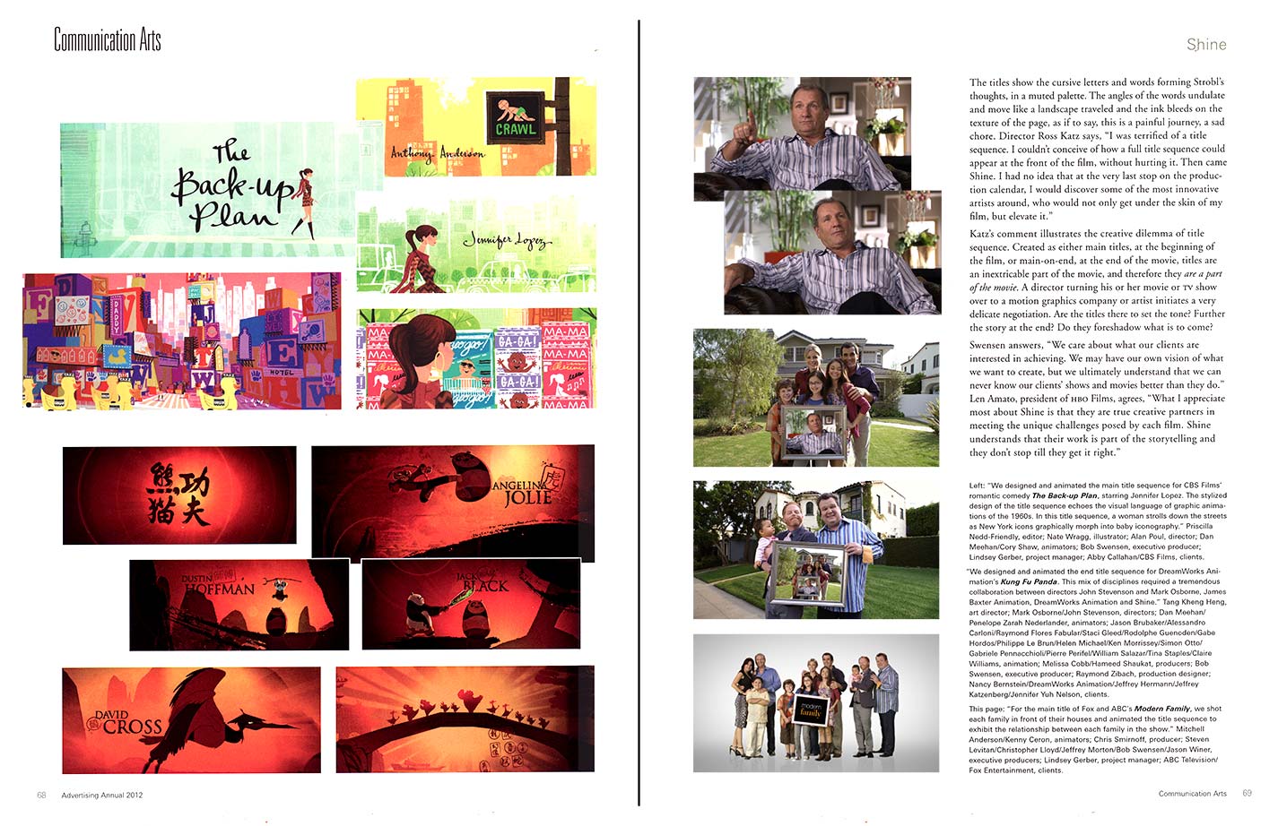
Riley is founder and creative director of motion graphics studio, Shine, which creates and produces film and TV main titles, and works in feature film marketing, network branding, and commercials graphics and design. Clients include film studios HBO Films, Paramount, Fox Television and DreamWorks and ad agencies including McKinney and Baldwin&. Located on the Miracle Mile of Wilshire Blvd. in mid-Los Angeles, high up in an art deco building, circa 1930, Riley started his firm in the garage of his home, just south of Hollywood, in 2005. Executive producer Bob Swensen, formerly head of production at R/GA Digital Studios in New York, leads the business side. Riley and Swensen have assembled a stable of artists and editors in a way that is uniquely suited to the wide array of projects they’re awarded. Keeping their offices and staff at a modest size and adding trusted personnel as needed, Shine has the freedom to work on projects small, immense, and in between—from title sequences for Kung Fu Panda, produced by DreamWorks Animation, with its myriad layers of steps and processes, to anindependent film by a first-time director. And they also work on commercials. Ad agency, McKinney went to Shine for a Qwest Communications project. The studio directed, designed and finished the campaign, a package of six :30 spots. Working with sand artist Ilana Yahav, the spots are beautiful little movies, showing one graphic image magically transforming into the next.
Their surroundings speak to their process. Ensconced in the historic, Raymond Chandler-esque building, the lobby is awash in old Los Angeles style and story, a study in the vibrantly muted colors of deco—deep and pale greens, golds, black. The ornate, coppery elevators are a throwback to a different time. Walking the corridor to Shine’s offices, the walls and flooring are resplendent with gorgeous Prairie-style design, a nod to Frank Lloyd Wright. But Shine’s offices are a stark left-turn. Clean and white, with natural woods, the studio is a blank canvas, soothing in its lack of clutter. Except for the vintage foreign movie posters that are part of Michael’s collection, the studio seems to say, ‘Here we are, ready for your project. We’ll take on whatever you’ve got, and we’ll tailor ourselves to your story, to your needs.’
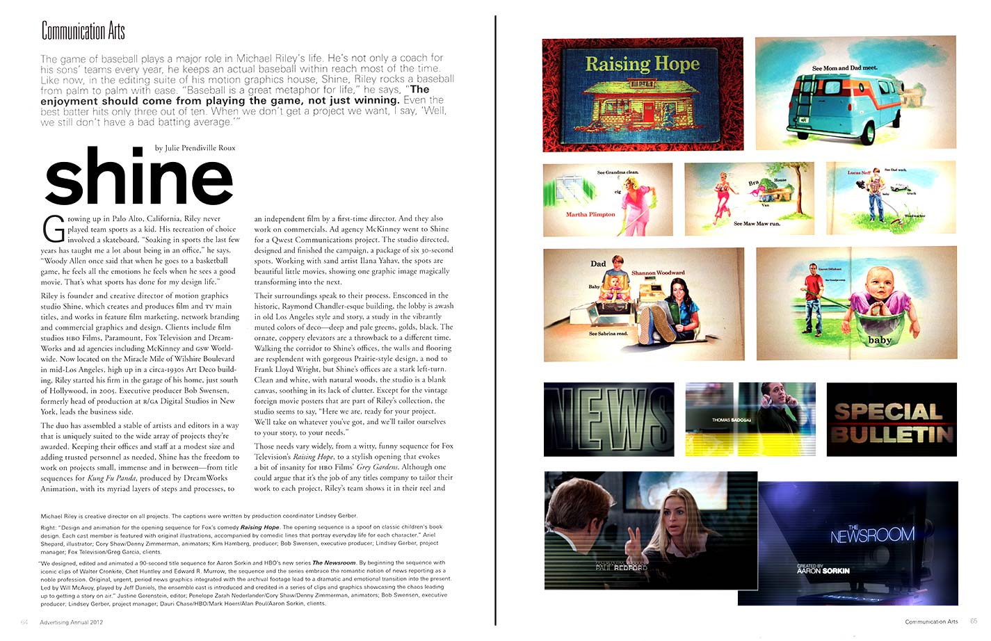
Those needs vary widely, from a witty, funny sequence for Fox Television’s “Raising Hope”, to a stylish opening that evokes a bit of insanity for HBO Films’ “Grey Gardens”. Although one could argue that it’s the job of any titles company to tailor their work to each project, Riley’s team shows it in their reel and their approach. For Aaron Sorkin’s HBO series “The Newsroom”, Shine captures the behind-the-scenes tumult and pre- production chaos using existing footage of iconic news greats such as Walter Cronkite and Edward R. Murrow, and segues into footage of the characters in the show, played by actors including Jeff Daniels, Emily Mortimer and Sam Waterston. In the midst of the hustle-and-bustle of new production, the titles are set to a beautiful orchestration by composer Thomas Newman. The theme is thoughtful and moving, rather than frenetic. Executive producer Alan Poul says, “We gave Shine the music first. It was the theme Aaron wanted. This show is, at heart, romantic in nature.” Shine strikes an evocative balance in the sequence, respectfully showing the business of news, with the music lending heart and humanity.
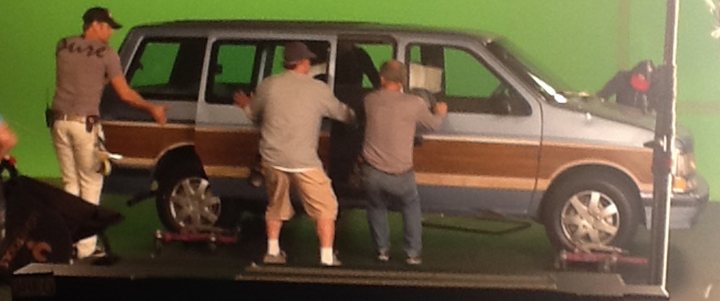
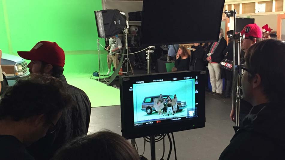
In pitching, the process starts in any number of ways. A director, producer, production company or ad agency provides input, sometimes in the form of a concise write-up, or maybe in a creative brief. Shine absorbs the assignment and often makes a large book of ideas, an exploration of five or six ways the titles or concepts might unfold, showing frames of screen grabs or art they’ve created. For ABC’s “Modern Family”, one idea was to paly around with the idea of family portraits. The winning idea has become a playful, memorable title sequence for the popular show. In executing their work, Shine either uses visuals from a movie or TV show, or, as in the case of Modern Family, Riley and his crew film the action.
At the root of each project is Riley’s vision. Like so many artists in motion graphics, Riley got his official start at R/GA Digital in New York. Founded in 1977 as Robert Greenburg Associates, the firm created film titles and special effects for commercials. But as digital became more and more relevant through the eighties and nineties, Greenburg re-launched as R/GA in 2004, and entered a new realm—the bits and bytes that create careers. Michael, who worked there from 1991 to 1996, remembers, “You could come up with an idea and there would be a level of execution that would cost 10 dollars or a million dollars. R/GA taught me that using simpler means, you can still get that idea across. Come up with best idea. That’s it.”
In 1996, Michael became a partner at Imaginary Forces in Hollywood. But it was an internship while attending Rhode Island School of Design, that was a turning point for Riley. At Tibor Kalman’s M&Co, New York, Michael interned under the direction of the late founder. The experience was exhilarating and inspiring, introducing him to Kalman’s seminal mixing of disciplines, spinning meaningful, compelling commercial art expression. “I thought, ‘Wow, he’s taking graphic design and mixing it with film’,” he remembers. Michael’s love of typography suddenly took on another dimension, lending him a new launchpad for his ideas. His mastery of type, and the pure art of it, is showcased in many projects, one being the eponymous HBO Films biopic “Temple Grandin”, exploring the true story of the accomplished autistic activist. Riley created a type style for the title that is simple, yet haunting, seemingly capturing her very nature. While immersed in the project, Riley noticed that Temple had an interesting quirk. He remembers, “When she drew animals, she did very analytical studies of them, and then, almost as an afterthought, she drew smiles on them. As if to say—they’re okay. It’s okay. So, ultimately, Temple Grandin is about being kind to animals.” In Shine’s opening titles of the film, Riley took this one detail and infused it into the schematic designs in the film’s titles. They evoke Grandin’s passion and intelligence, as well as her whimsically discerning eye.
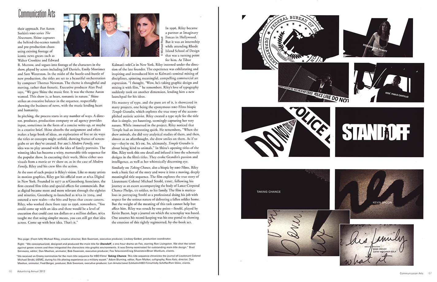
Similarly, on “Taking Chance”, also a biopic by HBO Films, Riley took a basic fact of the story and wove it into a moving, deeply meaningful title sequence. The film explores the true story of Lieutenant Colonel Michael Strobl, USMC, following his journey as an escort accompanying the body of Lance Corporal Chance Phelps, U.S. soldier, to his family. The film is meticulous in portraying Strobl as a professional doing his job with respect for the serious nature of delivering a fallen soldier home. But the weight of the meaning of this task cannot help but affect him. Riley was struck by one point—Strobl, played by Kevin Bacon, kept a journal on which the screenplay was based. One assumes his record-keeping was his one portal to showing the emotion of this tightly regimented, by-the-book act.
The titles show the cursive letters and words forming Strobl’s thoughts, in a muted palette. The angles of the words undulate and move like a landscape traveled, and the ink bleeds on the texture of the page, as if to say, this is a painful journey, a sad chore. Director Ross Katz says, “I was terrified of a title sequence. I couldn’t conceive of how of a full title sequence could appear at the front of the film, without hurting it. Then came Shine. I had no idea that at the very last stop on the production calendar, I would discover some of the most innovative artists around, who would not only get under the skin of my film, but elevate it.”
Katz’s comment illustrates the creative dilemma of the title sequences. Created as either main titles, at the beginning of the film, or main-on-end, as the full roster of credits roll, titles are an inextricable part of the movie, and therefore they are a part of the movie. A director turning his or her movie or tv show over to a motion graphics company or artist initiates a very delicate negotiation. Are the titles there to set the tone? Further the story at the end? Do they foreshadow what is to come? Swensen answers, “We care about what our clients are interested in achieving. We may have our own vision of what we want to create, but we ultimately understand that we can never know our clients’ shows and movies better than they do.” Len Amato, President of HBO Films, agrees, saying “What I appreciate most about Shine is that they are true creative partners in meeting the unique challenges posed by each film. Shine understands that their work is part of the storytelling and they don’t stop till they get it right.”
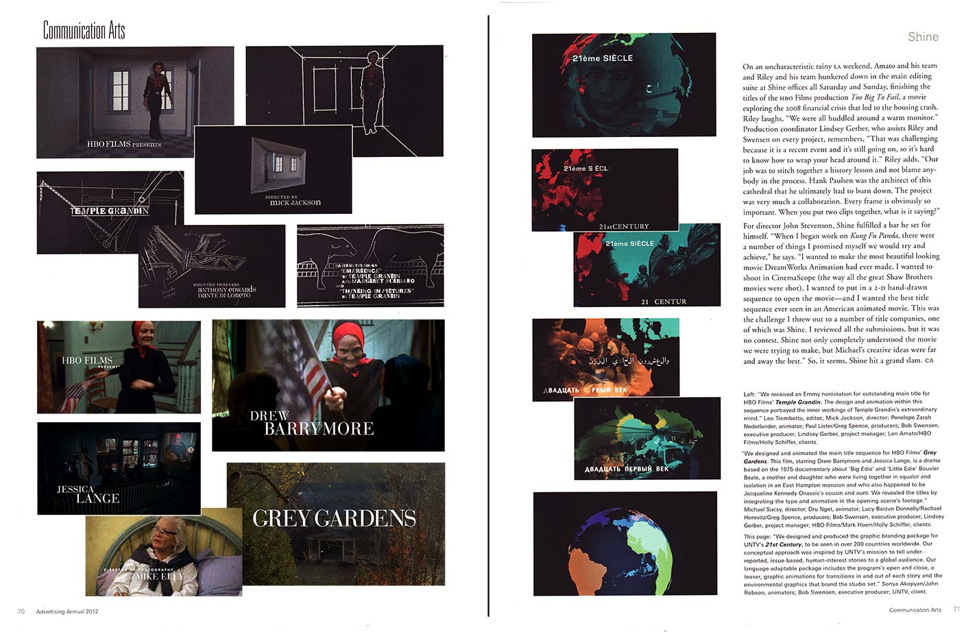
On an uncharacteristic rainy LA weekend, Amato and his team and Riley and his team hunkered down in the main editing suite at Shine offices all Saturday and Sunday, finishing the titles of HBO Films production “Too Big To Fail”, a movie exploring the 2008 financial crisis that led to the housing
crash. Riley laughs, “We were all huddled around a warm monitor.” Production coordinator Linsey Gerber, who assists Michael and Bob on every project, remembers, “That was challenging because it a recent event and it’s still going on, so it’s hard to know how to wrap your head around it.” Michael adds, “Our job was to stitch together a history lesson and not blame anybody in the process. Hank Paulsen was the architect of this cathedral that he ultimately had to burn down. It was very much a collaboration. Every frame is obviously so important. When you put two clips together, what is it saying?”
For director John Stevenson, Shine fulfilled a bar he set for himself. “When I began work on “Kung Fu Panda” there were a number of things I promised myself we would try and achieve,” he says. “I wanted to make the most beautiful looking movie DreamWorks Animation had ever made, I wanted to shoot in CinemaScope (the way all the great Shaw Brothers movies were shot), I wanted to put in a 2D hand-drawn sequence to open the movie–and I wanted the best title sequence ever seen in an American animated movie. This was the challenge I threw out to a number of title companies, one of which was Shine. I reviewed all the submissions, but it was no contest. Shine not only completely understood the movie we were trying to make but Michael’s creative ideas were far and away the best.” So–it seems Shine hit a grand slam.
Written by Julie Prendiville Roux for Communication Arts Magazine.
“King Julien New Year’s Eve”
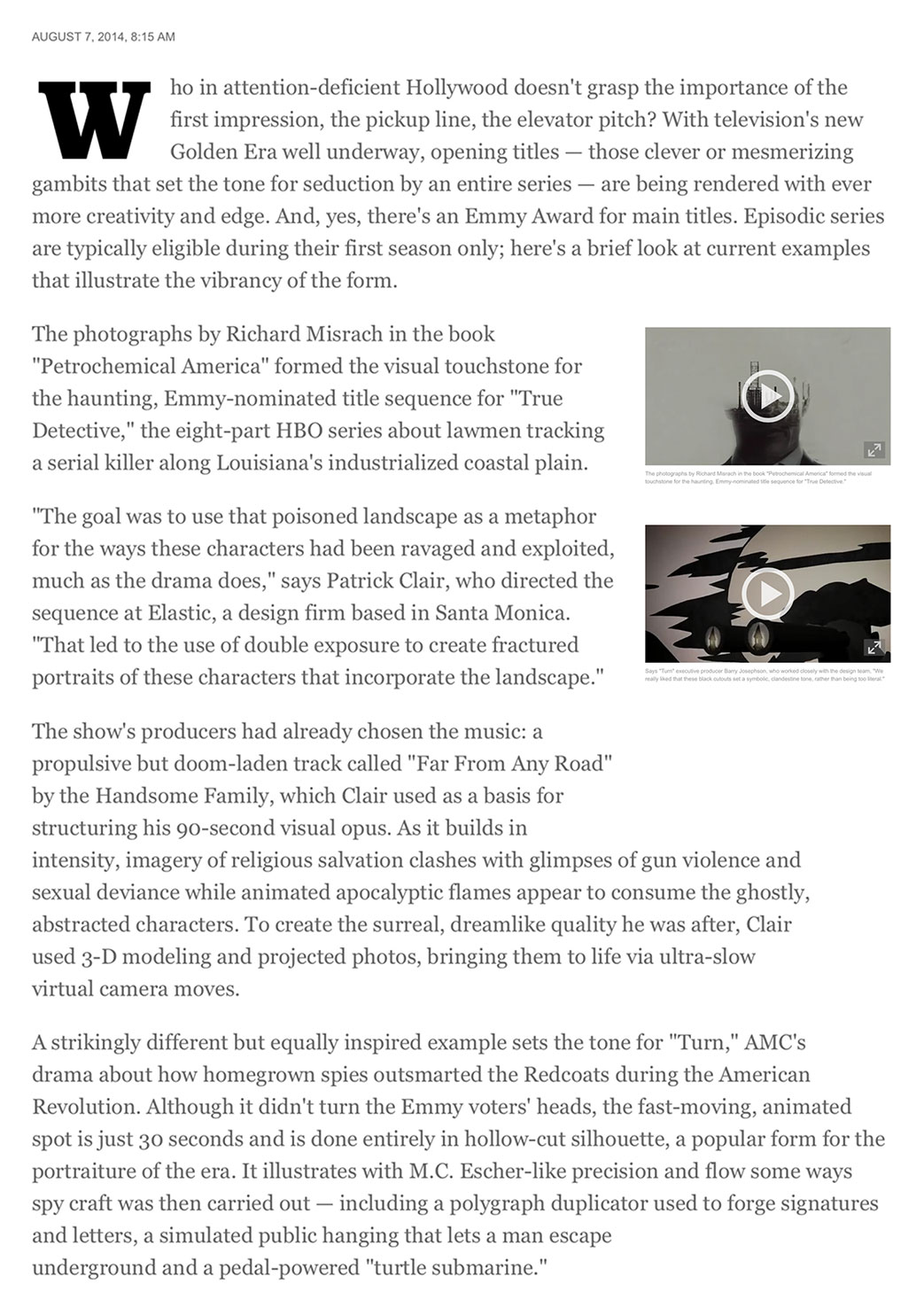
LA Times Feature
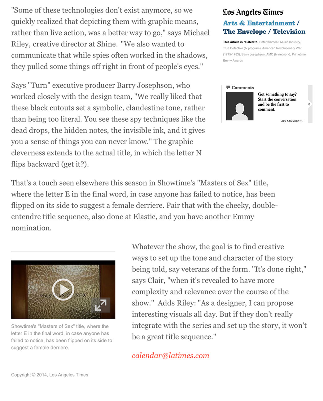
A big thank you to Amy Dawes at the Los Angeles Times for including Shine in its article about main titles and the intersection of television and storytelling using moving graphic design.
Post by Bob Swensen
Executive Producer
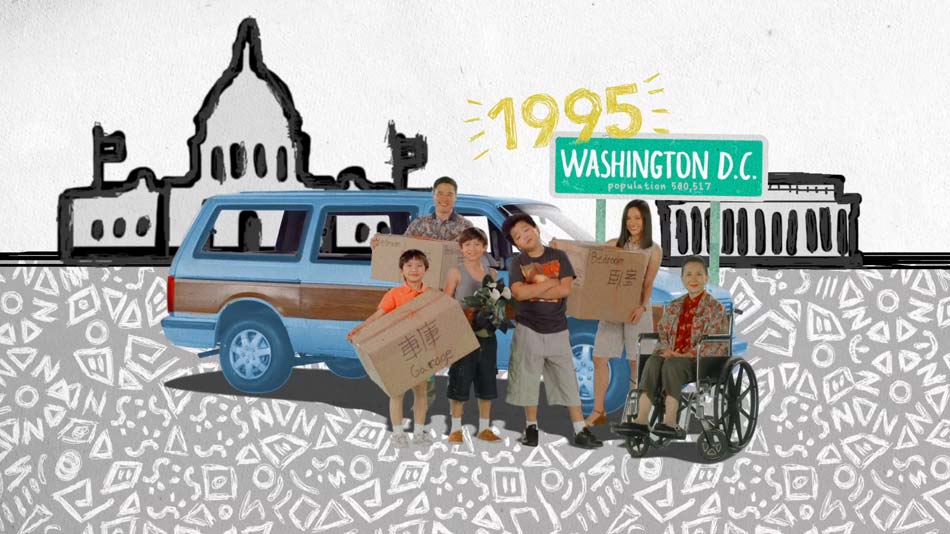
We just had a terrific shoot at Fox with the cast on Fox and ABC’s new family comedy “Fresh Off the Boat”, executive produced by Eddie Huang, Nanatchka Khan, and Jake Kasdan. The cast was smart, funny charismatic, creative, and all really nice to work with. It was a great way to wrap up 2014 before the Shine holiday break.